
How to Design the Back Cover of a Book: A Complete Step-by-Step Guide
Most advice about the back cover of the book focuses on copy first and production second. That’s backwards. A strong back cover has to do both jobs at once. It has to create enough curiosity to earn the sale, and it has to meet the technical requirements that keep your book printable, scannable, and retail-ready. If either side fails, the cover underperforms. In practice, the best back covers are clear, readable, emotionally specific, and built to spec from the start.
Importance of the Back Cover of the Book
The back cover of the book is where interest becomes intent. The front cover gets attention. The back cover answers the buyer’s quiet question: “Should I trust this book enough to open it or order it?”
That’s why weak back covers usually fail in two ways. They either say too much and bury the hook, or they ignore technical details that matter once the book leaves your screen and enters retail systems.
In Canada, back cover compliance isn’t cosmetic. The ISBN Agency has issued over 2.5 million ISBNs since 1980, and 78% of booksellers reject titles lacking compliant barcodes, which can lead to a 40% drop in sales potential for indie titles according to data cited at ebooklaunch.com’s guide to the back cover of a book.
Practical rule: If the back cover can’t be read quickly and scanned reliably, it isn’t finished.
An effective back cover usually handles five things well:
It hooks fast: The copy creates curiosity instead of explaining everything.
It establishes trust: Bio, endorsements, or both add credibility.
It reads cleanly: The hierarchy is obvious at a glance.
It preserves print accuracy: Bleeds, spine setup, and export settings are correct.
It supports distribution: Barcode, ISBN, and publisher details are in the right place.
Most authors spend too much time polishing the front and treat the back as leftover space. That’s a costly habit.
Writing a Compelling Back Cover Blurb
A good blurb doesn’t summarise the book. It sells the reading experience.
That distinction matters. When authors try to explain the whole plot, they flatten tension. The reader stops wondering what happens next because the copy already answered too much.
Why summary hurts fiction blurbs
For fiction, curiosity does the heavy lifting. Readers want a glimpse of the character, the pressure, and the stakes. They don’t want a compressed synopsis.
The range I recommend for fiction is about 120 to 180 words. That’s enough room to build intrigue without creating a dense block of text. Once the copy pushes much past that, the layout starts working against you too.
Don’t try to summarise the book. Create curiosity instead.
That means cutting backstory, side characters, and explanation. If a sentence exists only to clarify, it probably weakens the blurb.
A simple fiction blurb framework that works
This structure is dependable because it mirrors how readers make decisions.
Start with the character
Give the reader someone to anchor to. Name the protagonist or define them clearly.
Introduce the disruption
Show what changes. At this point, the story starts moving.
End before the payoff
Stop at the point where the reader feels unresolved tension.
A rough model looks like this:
| Part | Job | What to Avoid |
|---|---|---|
| Opening | Establish character and situation | Long worldbuilding |
| Middle | Introduce conflict or threat | Explaining every plot turn |
| Ending | Leave a live question | Revealing the outcome |
For memoir and narrative nonfiction, the same principle still applies, though the emphasis shifts. Lead with the central struggle or transformation, not a life summary.
What weak blurbs usually do
After reviewing a large number of back covers, the same mistakes show up repeatedly:
They explain the entire premise: The copy reads like jacket notes for an editor, not a buyer.
They introduce too many names: Readers lose the thread.
They overstate emotion: Words like “gripping” or “unforgettable” don’t persuade on their own.
They sound generic: If the blurb could fit ten other books in the genre, it won’t carry the sale.
A weak version might say:
Anna has always struggled with family expectations, career pressure, and the secrets of her past as she navigates love, betrayal, and redemption in a journey that changes everything.
A stronger version would narrow the lens:
Anna returns home for one funeral and finds the letter her mother never meant her to read. By nightfall, the story she’s been told about her family is gone. If she wants the truth, she’ll have to accuse the one person who still owns it.
The second version creates motion. It makes the reader ask a question.
For formatting, keep the blurb easy to scan. Short paragraphs beat one dense slab. On a physical back cover of the book, legibility matters as much as wording.
Featuring Author Bio and Endorsements
The decision between a bio and endorsements isn’t about fairness. It’s about which element adds more trust, faster.
Many authors assume both must appear. Often, that makes the back cover crowded and indecisive. In practice, one of them usually deserves priority.
When to add endorsements
Endorsements work best when the author is new, the subject needs validation, or the book enters a crowded category where outside credibility helps.
If you have a strong one-line endorsement, put it where it gets seen. I’ve seen covers improve by moving the best quote to a more visible position instead of burying it below the fold of the layout.
Use endorsements when:
The author is not yet known: Social proof fills the credibility gap.
The book needs instant framing: A concise endorsement tells readers how to read the book.
The quote source matters: Recognisable authority can reduce hesitation.
Keep them selective. One sharp endorsement beats three vague ones.
When to use a short bio instead
A bio earns its place when the author’s background is directly relevant. This is especially true for nonfiction, memoir with a strong lived-experience angle, and professional or educational books.
The back-cover bio should be brief and purposeful. Focus on credentials, publications, expertise, or platform. Skip personal details that don’t strengthen the case for the book.
A useful comparison:
| If This Is True | Prioritise |
|---|---|
| Debut novelist with little platform | Endorsements |
| Recognised expert writing nonfiction | Author bio |
| Memoir by someone with public profile | Short bio |
| Book with no strong endorsements yet | Tight bio or omit both and give space to copy |
If you include both, control the sequence. Lead with the item that builds trust faster for that title.
For most books, the order that reads best is:
Blurb first
Credibility element second
Publisher and barcode area last
That keeps the reader’s attention where it belongs.
Designing Layout and Typography for Back Cover
Layout problems usually start before typography does. Authors pick fonts, colours, and textures before they decide what the eye should notice first.
That’s why a back cover can look polished and still fail. It may be attractive, but the hierarchy is muddy.
If you’re working through the full relationship between cover concept, typography, and sales positioning, this guide on what book design is and how covers that sell are created is a useful companion.
Build visual hierarchy before styling
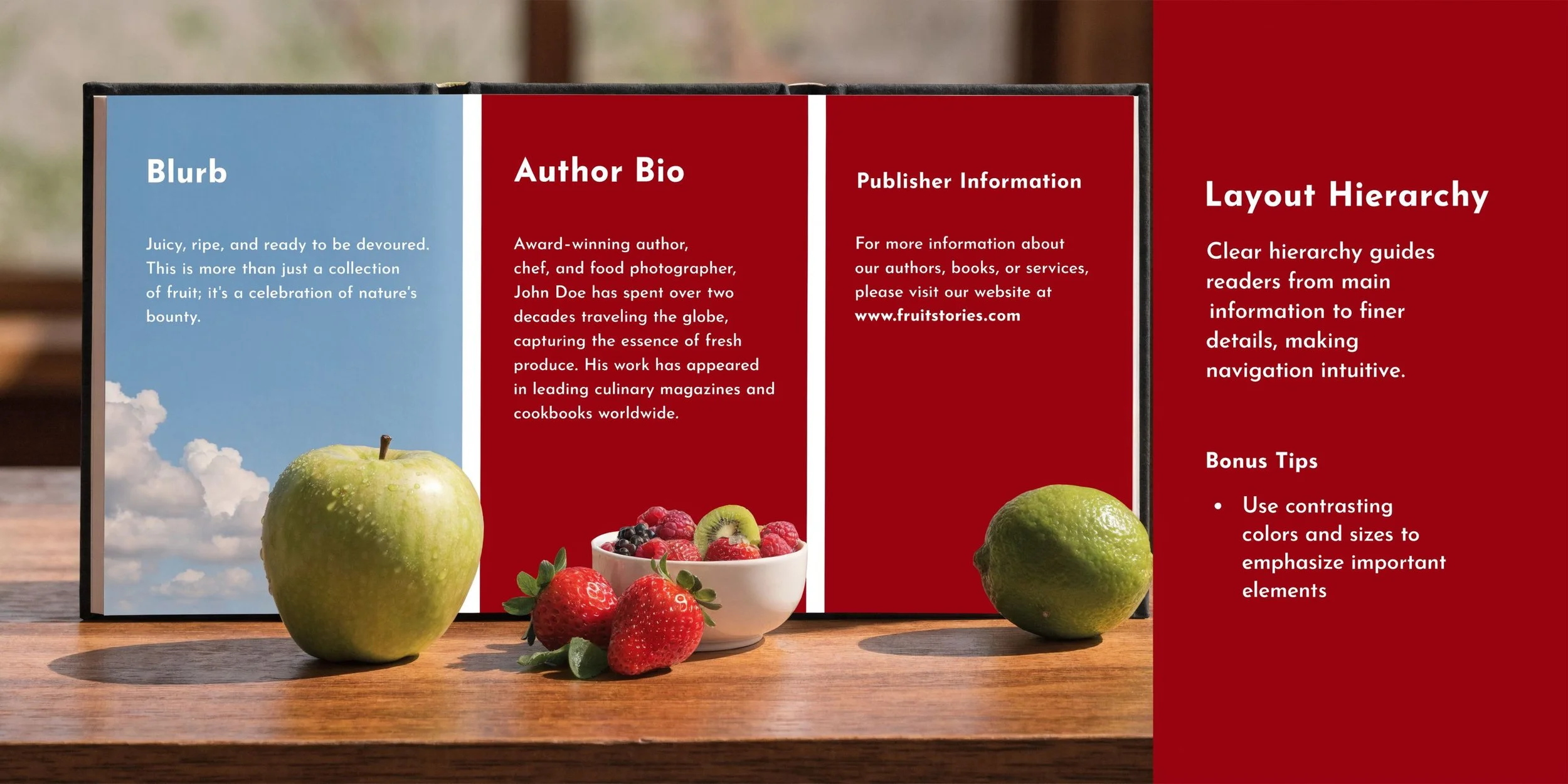
Most back covers work best when the layout follows a simple reading path from top to bottom.
A reliable structure looks like this:
Top area: Tagline or opening blurb lines
Middle area: Main blurb body
Lower middle: Bio or endorsements
Bottom area: Barcode, ISBN, imprint details, price area if needed
The mistake I see most often is trying to fill every inch. White space is not wasted space. It helps the reader distinguish selling copy from supporting information.
A crowded back cover signals uncertainty. Clean spacing signals control.
Background art also needs restraint. If the front cover image wraps to the back, lower the visual intensity behind text. Heavy contrast, busy textures, and dark overlays can make even good copy look amateur.
Typography choices that hold up in print
Back-cover typography has one job above all: readability at a glance.
Choose typefaces that match the book’s tone, but don’t let style overtake clarity. Decorative faces are usually better reserved for short display lines, not body copy.
A solid practical standard:
Use a clear body font: Avoid thin strokes and cramped letterforms.
Keep contrast high: Dark text on a calm light field, or light text on a stable dark field.
Watch line length: Long, wide lines feel tiring on the back cover.
Separate elements visibly: Bio, blurb, and endorsement should not blend together.
For fiction blurbs, short paragraphs create better scanning. For nonfiction, a slightly more structured rhythm can work, especially if the book promises clear takeaways.
If the back looks balanced only when viewed full size on screen, test it smaller. Many readers first see the cover spread online, not in hand. If the hierarchy disappears in a reduced view, simplify it.
Adding Barcode ISBN and Publisher Information
The lower section of the back cover of the book is where authors make some of the most expensive mistakes. This area looks minor, but it controls whether your file works in print.
If you’re handling assignment, barcode setup, and distribution together, Foglio’s page on ISBN, barcode, and distribution support shows how those pieces fit into one workflow.
What must appear on the lower back cover
In Canada, the ISBN is not just an administrative formality. It’s tied directly to discoverability and retail compatibility. As noted earlier, the ISBN Agency has issued over 2.5 million ISBNs since 1980, and missing or non-compliant barcode setup creates real sales friction.
The practical items to account for are:
ISBN barcode
Publisher or imprint name
Logo if used
Any required pricing or catalogue details
Optional CIP-related metadata where applicable
The barcode should be treated as a technical object, not a design accent. Keep the surrounding area clear. Don’t place it over noisy textures, deep shadows, or visual elements that interfere with scanning.
Common compliance mistakes
Most problems here aren’t dramatic. They’re small oversights that break functionality.
Common failures include:
Resizing the barcode carelessly
Placing it too close to trim
Using low-quality exported artwork
Letting background imagery compete with the code
Forgetting to reserve enough clean space at the bottom
In this scenario, authors often try to “make it fit” after the design is already done. That usually leads to a compromised layout.
A better approach is to reserve the barcode zone from the beginning. Treat it as fixed real estate. Everything else should design around it, not the other way around.
Preparing Print and Distribution Specifications
A back cover that looks right in Canva, InDesign, or Affinity Publisher can still fail the moment you upload it. That happens because printers and distributors don’t evaluate intention. They evaluate file construction.
For a deeper production reference, this article on print-ready book files covers the standards authors need before upload.
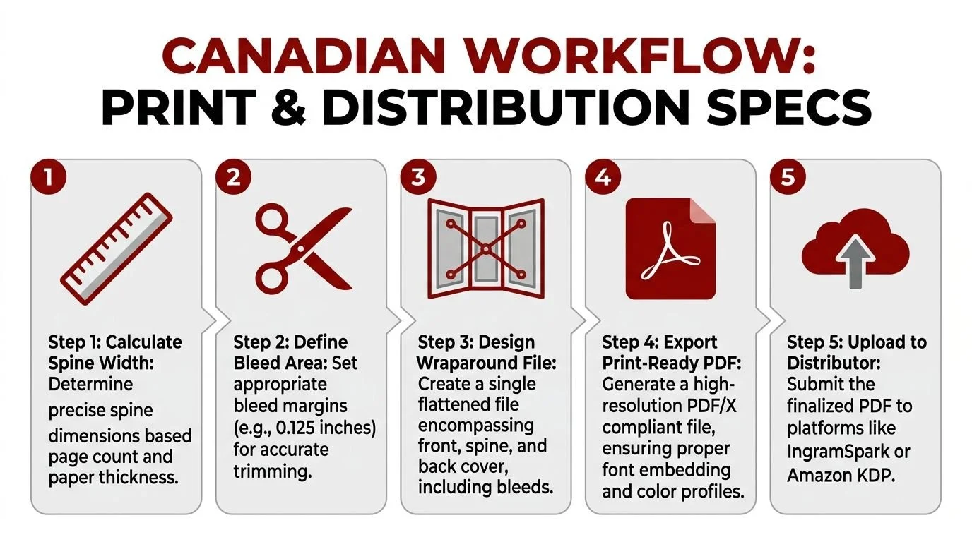
The wraparound file setup
For print-on-demand and short-run production, the cover should be built as a single wraparound file that includes front, spine, and back.
The workflow commonly used in Canadian print preparation includes these steps:
Calculate the spine width using page count, paper thickness, and the printer’s formula.
Build the full canvas as one flat file rather than separate panels.
Add bleed on all outer edges so trimming doesn’t expose white edges.
Export as a print-ready PDF with proper settings for press output.
The source material for this workflow notes that Canadian POD facilities see a 15 to 20% rejection rate due to misaligned bleeds, while following a four-step wraparound PDF method yields a first-pass success rate above 98% according to the Loudoun Library quick guide to covers PDF.
That’s the hidden side of back-cover design. The nicest copy on the page won’t help if the file is built incorrectly.
Where files get rejected
Rejections tend to cluster around a few repeat problems:
Bleeds don’t extend far enough
Spine width is calculated incorrectly
The spine text is rotated or aligned poorly
Export settings flatten or degrade the barcode area
Elements sit too close to trim or hinge zones
Most cover errors happen before the author ever uploads. They start in the file setup.
If you’re preparing your own files, always proof the full spread, not just the back panel. The back cover can be correct on its own and still shift once the spine and front are assembled into the final wrap.
Quality Assurance Checklist and Next Steps
A proper QA pass catches the issues authors miss when they’ve been staring at the same file too long. This step isn’t glamorous, but it prevents rework, rejected uploads, and avoidable delays.
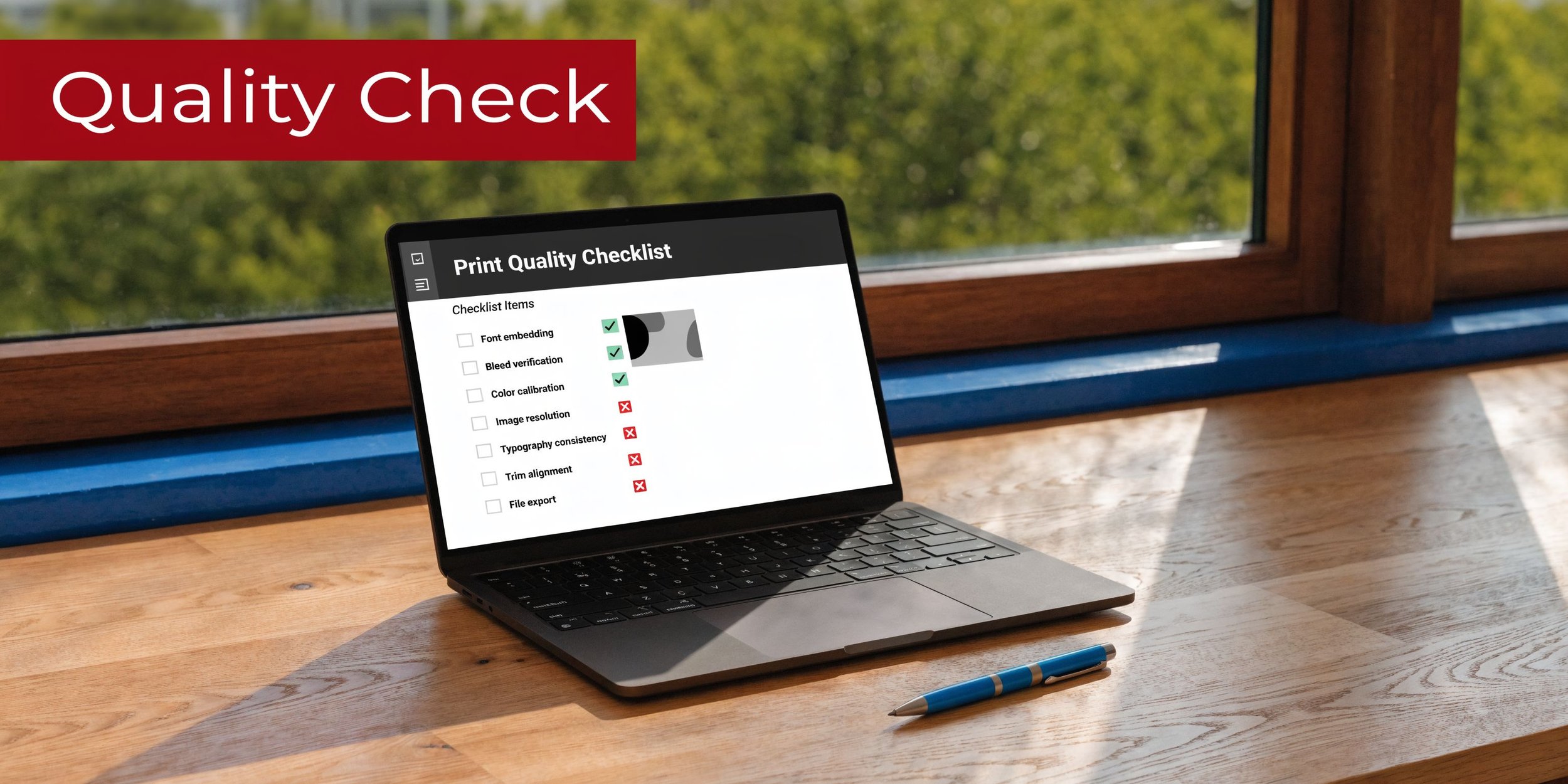
A practical back cover of book checklist
Before you approve the back cover, check these items one by one:
Blurb clarity: Does the copy create curiosity, or does it explain too much?
Hierarchy: Can a reader tell what to read first within seconds?
Spacing: Do text blocks have room to breathe?
Typography: Is every line readable at normal viewing distance?
Contrast: Does the text remain clear against the background image or colour?
Barcode area: Is the lower section clean and unobstructed?
ISBN accuracy: Does the printed number match the assigned metadata?
Imprint details: Are publisher name and logo consistent across assets?
Bleeds: Do background elements extend beyond trim where required?
Spine alignment: Does the spread still look balanced when assembled?
Export quality: Is the final PDF press-ready and free of accidental compression?
Physical proofing: Have you checked a printed or platform-generated proof view?
A useful habit is to review the back cover in three modes:
| View | What It Reveals |
|---|---|
| Full size on screen | Fine typography and spacing |
| Reduced thumbnail | Hierarchy and clutter |
| Printed sample | Contrast, scan ease, and trim risk |
What to do before you upload
Once the checklist is clean, move in order.
First, confirm the metadata. Then verify the final file name, trim size, and printer requirements. After that, upload only the final approved PDF, not a working export.
If the book includes photography, illustration, or colour-heavy design, proofing matters even more. Colour shifts and dark-value loss often show up only when the file leaves your monitor.
The authors who have the smoothest launches usually do one thing well. They treat the back cover as both marketing and production, not one or the other.
FAQ
What should be on the back cover of the book?
Most back covers include a blurb, optional author bio or endorsements, an ISBN barcode, and publisher or imprint details. The exact mix depends on the book and how credibility is best established.
How long should a back cover blurb be?
For fiction, 120 to 180 words is a strong working range. That’s usually enough to build tension without creating a dense text block.
Should a back cover summarise the entire story?
No. The blurb should create curiosity, not explain the full plot. Introduce the character, hint at the conflict, and stop before the resolution.
Is an author bio required on the back cover?
Not always. A bio is most useful when the author’s expertise or recognition strengthens trust. If the author is new, a strong endorsement may do more for the cover.
Where does the barcode go on the back cover?
It usually sits in the lower section of the back cover with enough clear space around it for reliable scanning. Don’t treat it as an afterthought or place it over busy artwork.
Why do print files for back covers get rejected?
Common reasons include misaligned bleeds, incorrect spine calculations, poor barcode placement, and export settings that don’t match printer requirements.
Do I need a full wraparound cover file for print-on-demand?
Yes. Print-on-demand platforms typically require a single spread that includes back cover, spine, and front cover, built to the correct trim and bleed specifications.