
Jan Tschichold’s Timeless Rules: What Modern Self-Publishers Can Learn from the Father of Book Design
If you have ever held a classic paperback and felt that everything on the page just “sits right,” you have met the quiet work of Jan Tschichold. He was a typographer who believed books should look simple, balanced, and humane. His rules were not fads. They were careful refinements of methods printers had used for centuries. The good news for indie authors is this: you can borrow the same principles and lift your self-published book from “okay” to enduring.
Who was Jan Tschichold?
Tschichold was a German-born typographer and teacher who shaped twentieth-century book design. Early in his career he championed modern, asymmetric layout and sans serif type. Later, working inside publishing houses, he returned to classical proportion, clear hierarchy, and restraint. When he joined Penguin in the late 1940s, he set firm composition rules that cleaned up punctuation, spacing, and page rhythm across the list. The result was a line of paperbacks that felt consistent and trustworthy to readers at a glance. His basic belief was simple: the best book design serves the text and the reader.
If you want your novel, memoir, or history to draw readers in and be considerate in its approach to cover and type design, study the patterns he revived and explained. He did not treat tradition as decoration. He treated it as tested knowledge.

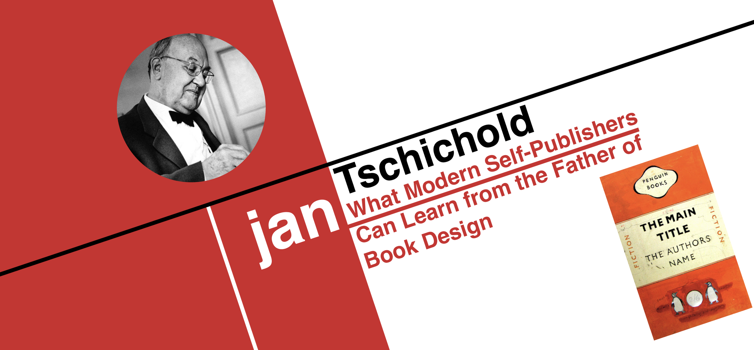
Absolutely iconic cover design “template” designed by Jan Tschichold. Surely, you’ve seen it before.
The canons of page construction
Centuries before desktop book design software, printers learned how to place a text block on a page so that the eye rests and moves with ease. Tschichold helped popularize those page “canons,” especially the Van de Graaf construction, which gives you a repeatable way to draw the text area on any page size. These canons show relationships between the page and the type area that often resolve into clear ratios like 2:3, 1:√2, 5:8, and the golden ratio. They were not accidents. They were intentional systems that yield harmonious margins and line lengths that are easy to read.
How to use this today: start your layout by placing the text block with a tested canon, not by guessing. If the type area is well placed, line length, leading, and margins tend to fall into place. That alone reduces the fussy “trial and error” that can bloat your page count or wreck legibility.
For hands-on help with page setup, see our Formatting & Typesetting service, where we build your interior from first principles so the page reads cleanly at any size.

Margin proportions and the Golden Canon
Tschichold favored margin ratios that give a book a calm base and an open outer edge. A well known scheme is 1:1:2:3 for inner, top, outer, and bottom margins. The bottom margin is the largest, which grounds the page. The outer margin is larger than the inner, which gives the thumb a place to sit and the eye a place to breathe. These proportions often align with the “Golden Canon,” where the text block’s shape relates to the page through the golden ratio. The point is not magic. It is consistency and comfort.
Where people go wrong: equal margins on all sides or a narrow bottom margin will make a page feel cramped and cheap. A tight inner margin will swallow words at the gutter once the book is bound.
If you want to dig deeper into trim sizes, paper, and how margins change with binding, read Choosing the Right Trim Size and Paper for Your Self-Published Book.
Typography and spacing that help readers
Tschichold’s advice sounds plain because it is. Choose typefaces that suit the text. Keep line length moderate. Maintain even rhythm from line to line. He liked paragraph indents for continuous prose and careful leading so the eye does not jump or tire. He also argued for consistent, optical letter and word spacing rather than mechanical gaps or gimmicks.
At Penguin he formalized these points in a short booklet of Composition Rules for compositors. Among other things, the rules discouraged extra space between sentences so that text would read smoothly and look even across the page. You can see that guidance referenced in the historical record and in scans of the booklet itself.
Modern takeaway: resist the urge to force “style” into your text block. Good typography disappears in service of the words. It is the difference between a book that invites long reading and one that only looks good in a thumbnail.
Need a professional interior that matches your genre and brand? Start here: Formatting & Typesetting. Taking your book digital as well? We ensure it passes validation and reads cleanly on every device with eBook Design & Validation.

The Penguin Composition Rules in plain language
When Tschichold arrived at Penguin he issued a slim, four-page set of rules to create unity across hundreds of titles. The rules covered punctuation standards, spacing, paragraphing, small caps and capitals, folios, and the general treatment of text. They aimed for consistent, optical balance rather than mechanical tricks. This was not pedantry. It was brand stewardship, and it taught a generation of readers to trust a Penguin book at first glance.
Why you should care: a consistent rule set will make your series or imprint look like it belongs together. Readers notice. Retailers notice. Reviewers notice. Your rules do not have to be Penguin’s rules, but they should be written down and followed.
If you are building an author brand, match your interior to your cover strategy. See Cover Design to craft a visual system that carries across print, ebook, and marketing assets.
“Nothing new” in book typography, and why that is good news
Tschichold liked to say that the basic methods of good book design were worked out long ago and that it is hard to improve them. That is not pessimism. It is freedom. You do not have to reinvent the page to achieve a high standard. When you follow durable ratios and spacing rules, your book reads more easily, printing costs are easier to predict, and small choices do not spiral into big errors. The canons and rules are a floor you can stand on while you focus on the hard work that only you can do: the writing.
If you want an overview of how these choices fit into the whole production path in Canada, read Self-Publishing in Canada: A Complete Guide to Professional Book Formatting and Typesetting.

Putting the principles to work
Here is a practical way to apply Tschichold’s ideas without getting lost in theory:
Pick your trim and place the text block first. Use a canonical layout like Van de Graaf to draw the type area, then check the 1:1:2:3 margin feel on a printed mock page.
Choose a book face that suits your text. Test 11 and 12 point with leading that gives lines room to breathe. Check whether long words or proper names cause awkward spacing.
Set paragraphing rules once. Use indents for continuous prose. Avoid extra spacing between paragraphs in body text unless your genre calls for it.
Proof on paper. Margins, alignment, and rhythm are easier to judge in print than on a backlit screen.
Keep your rules in a house style. If you plan a series, write down decisions on numbers, italics, small caps, hyphenation, and folios. It saves time on the next book.
We are happy to build and maintain your house style while we typeset. Start with Formatting & Typesetting and we will align your interior with your cover and genre.
Why these rules still matter for indie authors
Readers do not measure margins with a ruler. They feel them. They do not know your line length in characters. They sense comfort or strain. Tschichold’s rules survive because they deliver that comfort on almost any page size or genre. When you design within these proportions you also avoid waste. You are less likely to need oversized margins, bloated line spacing, or a font that drives your page count, and printing costs, through the roof. A calm, well formed page is also kinder to readers who spend long stretches with your story.
If you want help balancing beauty and budget, we can advise on trim, paper, and layout choices that meet Canadian POD norms and retailer expectations. Our guide on trim sizes and paper for Canadian authors is a good next read.
Parting thoughts
Jan Tschichold did not invent harmony on the page. He defended and clarified it. That is why his ideas still help working authors today. Start with proportion, place the text with care, choose type that stays out of the way, and write down your rules. Your book will look like it belongs on a shelf with the best of them.
If you want your interior to carry that quiet quality from first page to last, talk to us. Begin with Formatting & Typesetting, add Cover Design, and finish with a clean digital edition through eBook Design & Validation. We will bring the principles to life while you focus on the writing.
