
The Unparalleled Joy of House Styles in Book Design
If you’ve read any of my blog posts, watched any of my recent podcast episodes, or attended one of our Self-Publishing Masterclasses, you’ve certainly heard me mention the importance of cover design. Cover design does many things for a book (and for authors). It turns passersby into customers, and, if done correctly, it signals to readers your intentions for your book. Genre readers (that is, fans of mystery, science fiction, romance, fantasy, etc.) are very sensitive to the tropes associated with their particular genres. They have certain expectations that, however tiresome, should almost always be employed to some extent. A sans serif typeface may seem out of place on a fantasy novel, while bright colours and handwritten typefaces may be more suited to a children’s book rather than a hard-boiled detective novel.
All that to say, readers don’t want to be presented with a new chore when they’re confronted with a book cover. Yes, you should use the book cover of your dreams. No, you shouldn’t just cater to the market’s demands. And yet, it’s important to note that your book cover does more than just convey a visual summary of your book’s plot.
I think we can all learn a valuable lesson on book design from the “house styles” of various publishers. These house styles don’t break boundaries or shatter conventions, but they signal uniformity and trust, and maybe that’s part of the reason for their success.
In this post, I’m going to cover some of my favourite house styles, all with the intention of showing that building an author or publisher brand identity has very little to do with cutting-edge design or bold typography, and everything to do with consistency.
First up, Faber & Faber’s poetry collections:
Faber & Faber uses a few different house styles for their poetry collections, which changes based on the themes of a particular series. There’s the Faber Nature Poets series and the Poet to Poet series, for example, but the most striking to me, perhaps because of its simplicity, is their standard poetry series. These covers, designed by Justus Oehler, are a testament to the unparalleled power of minimalist design. They all use the same typeface and paper stock, and differ only in the colours use. “The use of typography only on the covers, rather than images, makes the volumes feel more honest and should appeal to real bibliophiles,” says Oehler. “The colours are used to express the feeling and mood of each book,” he adds. This same styling is used for over 400 titles as of this writing.

If ever there were book covers that needed to be felt in order to be understood, it’s these. The cover design is one thing (it’s remarkable), but there’s something about the paper stock that takes these Faber poetry collections to another level entirely. Looking for a recommendation? “Moy Sand and Gravel” by Paul Muldoon.
Second on my list is Penguin Classics.
Penguin has undergone several redesigns over the decades, but one of its most enduring and beloved is the black-and-white label version of Penguin Classics, a house style so recognizably elegant that it seems almost immune to trends. Designed by Jim Stoddart, Penguin’s art director since the early 2000s, this series preserves a sense of quiet dignity across every title. Whether you’re holding Dostoevsky or Dickinson, the visual treatment is virtually identical.

Stoddart’s recent updates to the series included subtle changes to the typefaces and spacing, with a renewed focus on the balance and clarity of the series. The fonts have shifted toward a slightly more contemporary feel with the use of sans serif typefaces on the cover, but the black and white bands and the centred penguin logo—hallmarks of Penguin Classics since the 2003 redesign—remain firmly in place. It’s serious but never severe. Penguin themselves described this series as offering “timeless design for timeless literature.”
And that’s exactly what makes it so compelling. By adhering to a consistent visual identity, Penguin Classics does more than just sell books—it curates a literary experience, one in which all authors, whether ancient or modern, are given equal footing, an equal opportunity to be considered a “classic”.
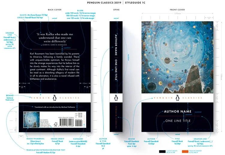
The style guide for the recently-revised Penguin Classics series.
And that brings me to Oxford World’s Classics.
If Penguin’s strength lies in elegant minimalism, Oxford’s might be in their appearance quiet scholarship. The Oxford World’s Classics series, recognized by its crimson spine band, left-aligned typography, and carefully chosen period paintings, has remained visually consistent for decades. Originally redesigned by Deborah Cook in the late 1980s and later refined under the guidance of Keith Scoble, the series hasn’t needed radical change. And that’s precisely the point.
These covers wear their academic seriousness with pride. The font is conservative, the layout formulaic, and the overall effect is reassuring. You don’t pick up an Oxford World’s Classic expecting fireworks; you expect the literary equivalent of a well-prepared lecture: rich, grounded, and delicately presented.
What makes Oxford’s design so powerful is its democratic effect. Whether you’re reading Aristotle, Mary Shelley, or an anonymous medieval ballad, the cover treatment is the same. No flashy visuals, no hierarchy among different titles, just a quiet promise of quality and intellectual rigour.
My favourite aspect about the Oxford World’s Classics series, however, is seeing what particular little section of the artwork the designers choose to emphasize on the spine. Here are some of my favourites…
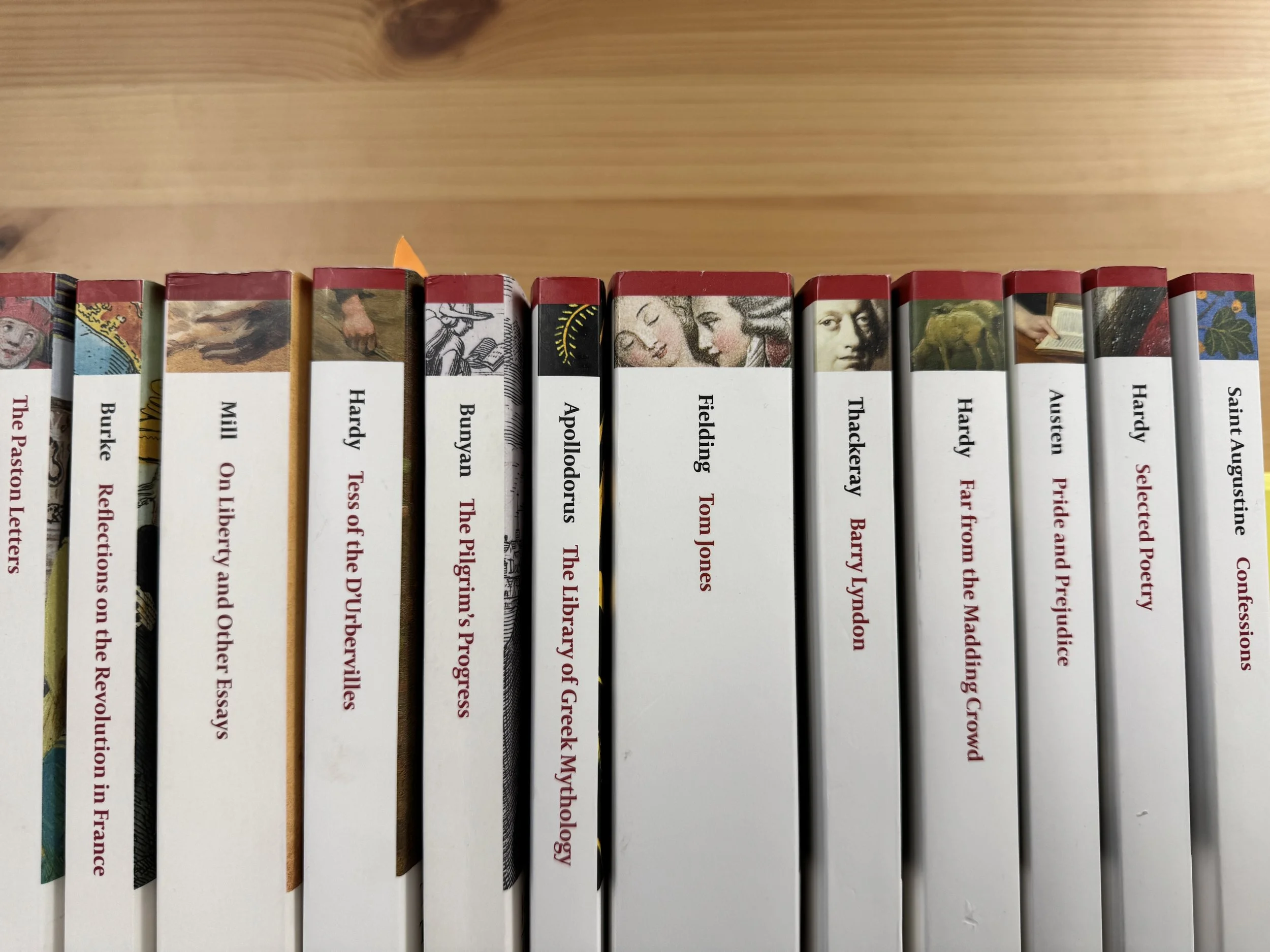
Some of my favourites are Tess of the D’Urbervilles and Tom Jones.
Faber, Penguin, and Oxford have something important to teach us: the most lasting design isn’t about standing out; it’s about standing firm. These house styles stick around not just because they’re aesthetically pleasing, but because they reduce friction for the reader, offering a stable and welcoming gateway to great literature. And in a publishing world that often privileges spectacle, that quiet consistency is a beautiful thing.
Need help designing a lasting author brand? Schedule a free consultation with me or attend an upcoming Self-Publishing Masterclass. You can also download our free guide, Foglio’s 4-Stage Path to Publishing Success, which provides a deep dive into all aspects of the publishing process and explains some of the jargon commonly used in the publishing industry.
