
CMYK vs RGB for Print: A Guide for Book Authors
For any project headed to print, your final files should be prepared for CMYK, because print uses ink and screens use light. RGB can display 16,777,216 colours, while CMYK can theoretically create up to four billion, but that doesn't mean an RGB cover will print better. In practice, bright screen colours can still fall outside the printable range and shift noticeably on paper.
That's the part that catches many self-publishing authors off guard. A cover can look bold and polished on a laptop, then arrive from the printer with flatter blues, softer purples, or reds that don't hit the same way. The issue usually isn't that anyone made a mistake. It's that the artwork was built for a glowing screen, then pushed into a physical ink process at the end.
The good news is that this is manageable. If you understand cmyk vs rgb for print, you can make smarter design choices early, preview likely shifts before production, and avoid the most common disappointments.
The Difference Between CMYK and RGB for Printing Your Book
If your book will exist as a physical product, CMYK is the print colour model you need to plan around. RGB is built for screens such as laptops, phones, tablets, and online storefronts. CMYK is built for ink on paper.
This matters most when an author approves a digital cover and expects the printed copy to match it exactly. On screen, the cover is lit from behind. In print, the paper only reflects light. That difference changes how colour is produced and how strong certain tones can appear.
A simple comparison helps:
| Feature | RGB | CMYK |
|---|---|---|
| Best use | Screens and digital graphics | Printed books and covers |
| How colour is made | Light | Ink |
| Visual feel | Brighter, more luminous | More restrained, print-realistic |
| Risk when used for print | Strong colour shifts after conversion | Better control over final output |
| Best role in a book project | eBooks, ads, thumbnails, website assets | Final print production |
Authors often run into trouble when they build everything for online use first, then send the same files straight to print. That's when electric blues, neon accents, and vivid gradients lose impact.
Practical rule: If you're printing a book, make print decisions using print conditions, not screen excitement.
There's also a workflow issue. Good print colour isn't just about choosing CMYK at the end. It's about using the right profile, checking how colours will reproduce, and exporting correctly. That's especially important with print-on-demand, where consistency matters and surprises are expensive to fix after approval.
If you're comparing services for book print-on-demand in Canada, ask how they handle colour conversion, proofing, and file setup before you upload anything. Those steps have more impact on your result than most authors realise.
Understanding the Colour Models RGB vs CMYK
RGB and CMYK describe two different ways of making colour. They aren't interchangeable, even if design software lets you switch between them with one click.
How RGB works
RGB stands for Red, Green, and Blue. It is an additive colour model. That means it starts with black and adds coloured light. As more light is added, the result moves toward white.
That's why screens can make colours feel crisp, glowing, and intense. Phones, tablets, monitors, and eReaders all display colour this way.
How CMYK works
CMYK stands for Cyan, Magenta, Yellow, and Key Black. It is a subtractive colour model. It begins with white paper, then layers ink to absorb light and create colour.
A good mental image is this:
RGB is like coloured stage lights
CMYK is like mixing inks on a white sheet
The systems behave differently because the materials are different. Light can glow. Ink can't.
According to this guide on print colour spaces, RGB can create up to 16,777,216 colours, while CMYK can theoretically create up to four billion. But the same source also notes that when RGB artwork is converted for print, many bright colours can fall out of gamut, meaning they sit outside what ink can reproduce on paper.
Why this matters to authors
Many new publishers find this stage confusing. They hear that CMYK is “smaller” in practical print terms, but then see a larger theoretical number attached to it. The essential takeaway isn't the headline number. It's that screen colour and print colour do not map perfectly.
For books, the right question isn't “Which mode has more colours?” It's “Which mode gives me predictable printed colour?”
That answer depends on the job:
Use RGB for digital assets such as website banners, Amazon graphics, and social media images
Use CMYK-aware production for print files such as covers, interiors, and marketing materials that will be physically printed
Check problem colours early if your design includes saturated blues, purples, teals, or neon effects
If a colour only looks impressive because the screen is lighting it up, paper won't reproduce that feeling the same way.
Why Your Colours Shift The Gamut Problem Explained
Most print disappointment comes down to one idea. Gamut is the range of colours a system can reproduce.
RGB has access to colours created by emitted light. CMYK has access to colours made by physical ink on paper. Those two ranges overlap, but they don't match. The colours that sit outside printable ink range are where authors get surprised.
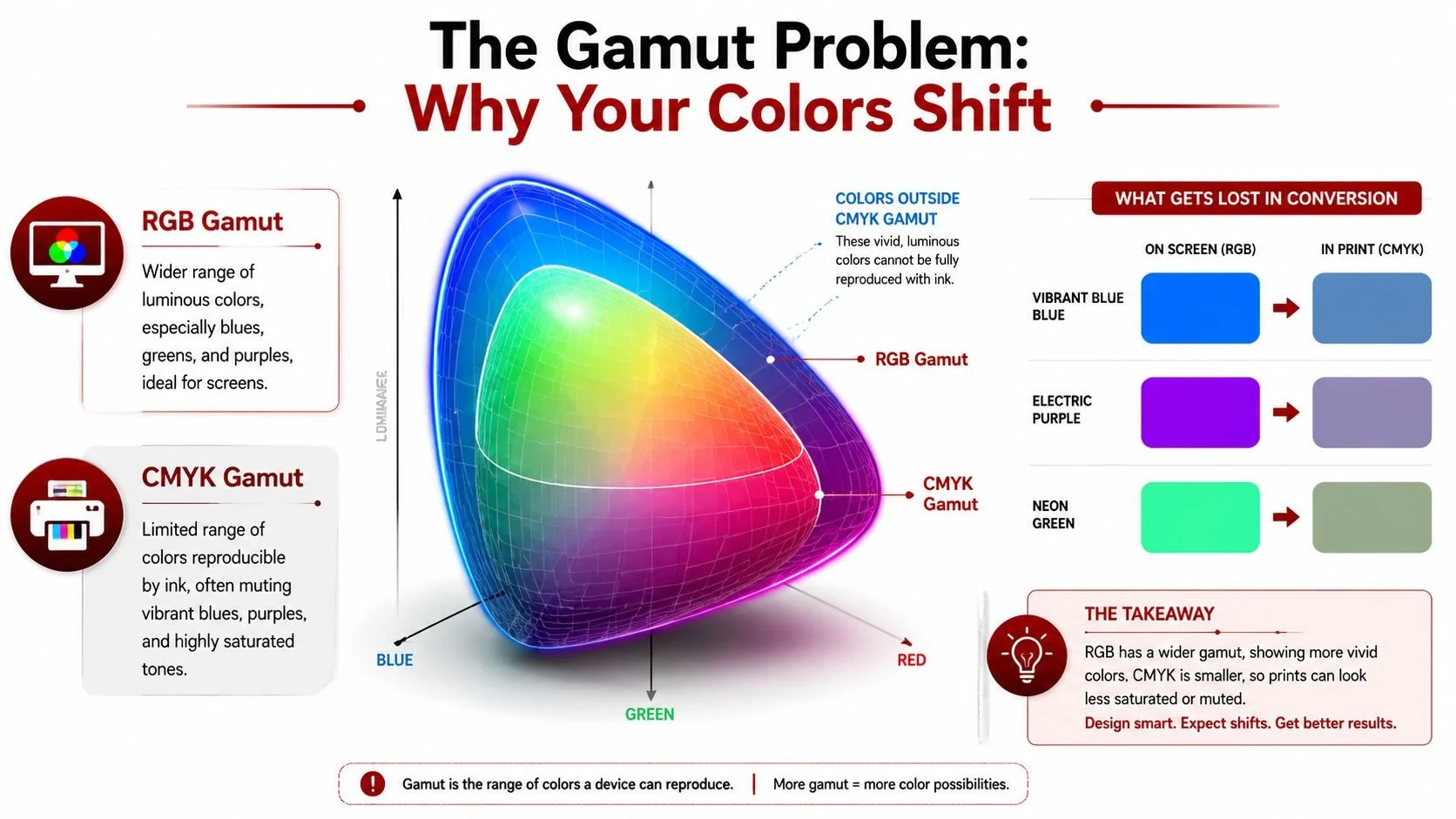
Where shifts happen most often
In real book design work, the colours that cause trouble are usually:
Vibrant blues that look electric on screen
Purples and blue-violets that lose depth in print
Neon-like accents that flatten once ink replaces light
Highly saturated gradients that look smooth on screen but less luminous on paper
One common example is a blue gradient that leans slightly teal in RGB. On screen, it can feel glossy and alive. After conversion, the same area often prints flatter and less radiant. Reds can shift too, but blues and purples usually create the biggest shock.
A colour shift doesn't always mean the printer failed. Often, the original file contained colours ink simply couldn't reach.
What the numbers show
The effect isn't just visual opinion. A 2025 GATF Canada benchmark study referenced here reports that CMYK outperforms RGB in print fidelity by 35% in Delta E colour difference measurements. The same data shows an average ΔE of 2.1 for CMYK-native designs versus 7.8 for RGB-converted files on common book paper stock.
You don't need to work in Delta E every day to use that information well. The practical reading is simple. Files built with print in mind tend to reproduce more accurately than files converted late from screen-first colour.
What authors should do with this
The best response isn't panic. It's adjustment.
Use this checklist when your book includes strong colour:
Flag risky colours early
If the cover relies on neon effects or very bright blues, treat them as suspect from the start.Preview the print result before export
Soft-proofing in Adobe Photoshop, Illustrator, or InDesign helps you catch muted areas before production.Edit for print, not just appearance on screen
Sometimes a slightly less flashy screen version produces a much stronger printed result.Test gradients carefully
Gradients that depend on subtle luminosity often need extra attention to avoid a dead-looking print transition.
Understanding gamut provides significant value. It gives you control before the proof arrives.
A Modern Workflow for Digital and Print Success
The old advice was simple. Design in CMYK if the final piece will be printed. That still holds value for many projects, but book publishing now sits in a more mixed environment. Authors need print-ready files and strong digital assets at the same time.
A book cover has to work on paper, but it also has to sell online as a thumbnail, ad image, launch graphic, and retailer listing. If you force everything into CMYK too early, your digital visuals can lose energy. If you stay only in RGB, your printed book can disappoint.
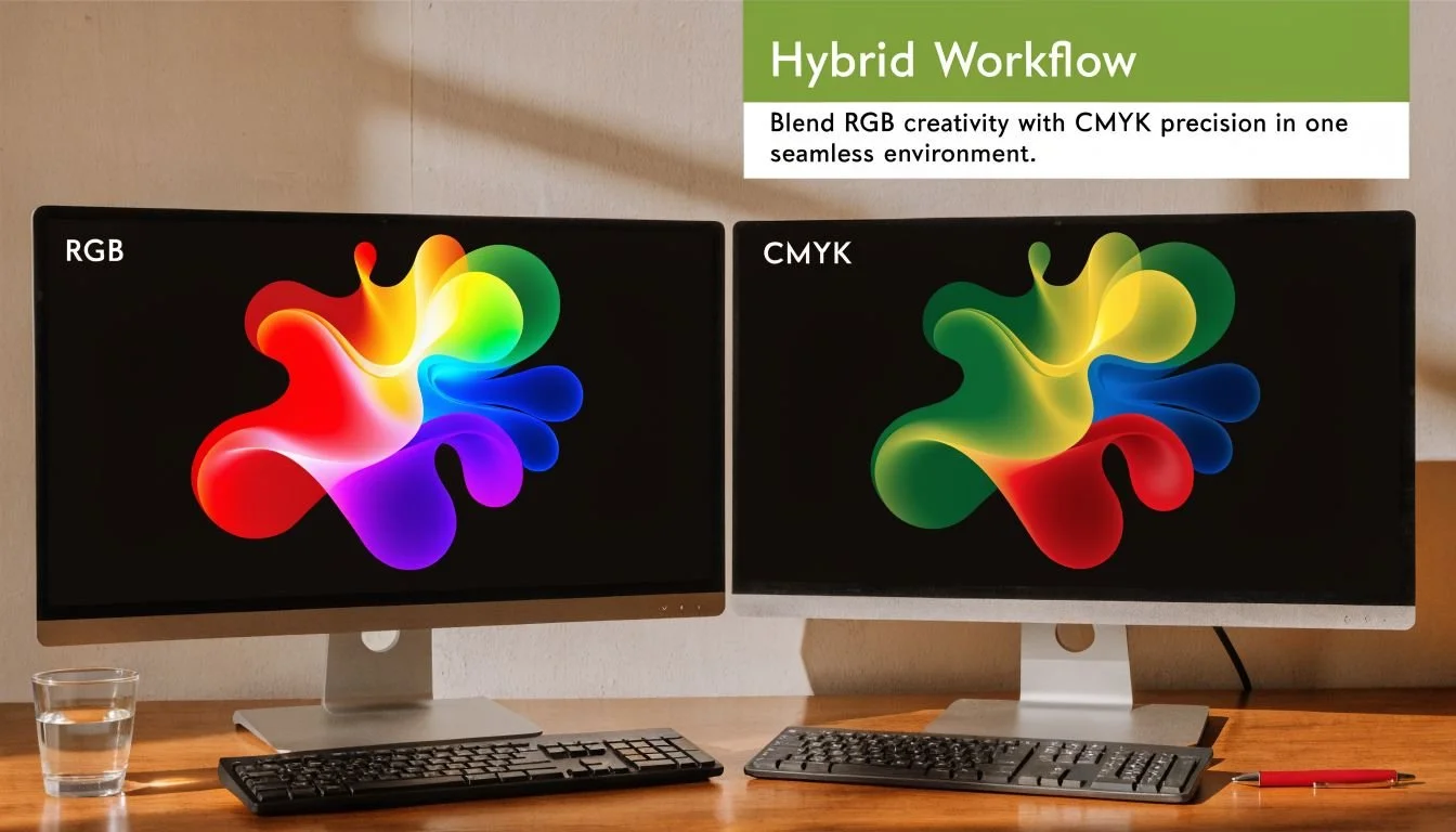
The workflow that usually works best
For many self-publishing projects, the strongest approach is a dual-file workflow:
Create a master design in RGB when digital marketing is a major priority
Build a separate print-optimised CMYK version for production
Adjust each version for its real environment instead of forcing one file to do both jobs badly
That approach avoids the common trap of converting the same art back and forth. Repeated conversions tend to create extra correction work and unnecessary revision rounds.
Why hybrid workflows are growing
This shift isn't just theory. A 2025 BookNet Canada report discussed here says 42% of self-published titles via POD platforms now support expanded gamuts, reproducing up to 95% of RGB vibrancy. That same reporting reflects growing use of hybrid RGB-to-CMYK workflows for books that need both online impact and solid print results.
That doesn't mean CMYK no longer matters. It means the process has become more flexible. A modern workflow can preserve digital vibrancy longer, then convert with intention for print.
Working rule: Keep one version for screens and one version for paper. Don't ask a single master file to solve two different colour problems at once.
A practical example
This comes up often with books that have a strong launch campaign. An author may need:
Amazon listing graphics
social media ads
website banners
email header artwork
a printed softcover or hardcover
If those assets start in CMYK, the digital versions often look duller than they need to. If they stay in RGB all the way through, the print version may need heavy correction at the end.
A cleaner workflow is to let the digital master stay vibrant, then create a dedicated print version with adjusted tones, controlled shadows, and safer gradients. That saves time because you're not constantly undoing colour compromises.
If you're also reviewing cost trade-offs in trim, paper, and colour production, this article on cutting book production costs through smart print choices is worth reading alongside your file prep plan.
How to Prepare and Convert Your Files for Printing
Good colour results come from setup, not luck. The software matters, but the workflow matters more. Adobe InDesign, Adobe Photoshop, and Adobe Illustrator remain the safest tools for this because they support profiles, soft-proofing, and controlled export.
A practical baseline for print files is straightforward:
300 DPI at final size
high-quality TIFF, PNG, or JPEG sources
no screenshots or compressed web images
careful review at 100% zoom
a physical proof before the full run
Choosing the right ICC profile
An ICC profile tells your software how colour should be interpreted for a specific output condition. Without the right profile, conversion becomes guesswork.
For book printing in Canada, profile choice also ties into compliance and production consistency. According to this Canadian-focused overview of RGB vs CMYK for printing, professional printers use G7-certified CMYK profiles like Fogra39/ISO 12647-2 for Canadian book printing. The same source notes that this helps avoid colour issues and supports compliance for books that need to meet Health Canada ink safety expectations, especially children's books.
If your printer supplies an ICC profile, use that first. If not, ask what they expect before you export final files.
Using soft-proofing to preview colours
Soft-proofing is one of the most useful tools in the whole process. It simulates, as closely as possible, how your file will reproduce under print conditions.
Use it to catch:
Muted blues and purples
Oversaturated cover backgrounds
Shadow areas that plug up
Gradients that lose smoothness
Unexpected changes in skin tones or photos
In Adobe software, this usually means loading the intended print profile and previewing the file before export. For Photoshop conversions, many production teams also use Edit > Convert to Profile with a print profile such as U.S. Web Coated (SWOP) v2 when that matches the print condition being targeted.
Screens are helpful for previewing. They are not final truth. Soft-proofing gets you closer, but the printed proof settles the argument.
Exporting a print-ready PDF
A solid export does three things. It keeps image quality intact, preserves colour intent, and avoids accidental output changes.
Before exporting, check:
Resolution
Images should be at final print size and meet the printer's required resolution. For books, 300 DPI is the normal baseline.Colour handling
Don't rely on a default export preset if you haven't checked how it treats profiles and output conversion.Fonts and transparency
Make sure your PDF preserves text correctly and doesn't create strange transparency shifts.Bleeds and trim
Covers especially need correct bleed settings. A colour issue can look worse when trim is also off.Final review at 100%
Zoomed-out review hides problems. Check the file at actual working scale.
For a more complete production checklist, review these print-ready book file requirements before sending anything to your printer.
Troubleshooting Common Print Colour Problems
Sometimes the files are already made and the proof comes back wrong. At that point, the fastest way forward is to diagnose the symptom instead of guessing.
My blacks look faded or grey
This usually happens when black areas weren't built strongly for print conditions. A screen black can feel deep because the display emits light contrast. Printed black depends on ink behaviour and paper.
Check whether the file uses a print-appropriate black build for the job. Also look at the paper. Uncoated stock can make dark areas appear softer than expected.
My photos look blurry or pixelated
This isn't a colour mode issue most of the time. It's a source file issue.
Common causes include:
Screenshots used as print images
Web images pulled from online listings
Files enlarged after placement
Embedded text inside low-resolution graphics
The safest standard is still 300 DPI at final print size. Upscaling a weak image later won't create true detail.
My bright logo colour looks flat
This is often a gamut problem. Colours that looked intense on a phone or monitor may not exist in printable form the way you saw them on screen.
The fix is usually to adjust the logo colour for print rather than trying to force a direct conversion. You may need a slightly different print version that keeps the brand feel without chasing an unprintable glow.
My proof still doesn't match my screen
That can happen even with careful prep. Monitor settings vary. Room light changes perception. Paper stock changes the result again.
The most reliable troubleshooting step is still the physical proof. Review it before approving the full run.
That final proof copy is the one step I wouldn't skip. Screens can mislead you. Print shows you what readers will hold.
Frequently Asked Questions About CMYK vs RGB
Can I use a free online converter to change RGB to CMYK
You can, but it's risky for book production. Free converters usually don't give you profile control, soft-proofing, or a reliable preview of how colours will print. That means you lose the chance to correct dull blues, clipped saturation, or muddy shadows before export.
If my book is only an eBook, do I need CMYK
No. If the book will only be viewed on screens, RGB is the correct choice. eBooks, retailer graphics, website banners, and social media images all belong in screen-first colour workflows.
Should I always design in CMYK for print
Not always at the earliest stage. If your project needs both strong digital marketing and accurate print production, a hybrid workflow often works better. Many teams now keep an RGB master for digital use and create a separate print-optimised CMYK file for production.
What's the difference between CMYK and spot colours
CMYK builds colour by combining four process inks. Spot colours, such as Pantone inks, are pre-mixed specific colours used when a very exact result is required. Most self-published books use standard process printing, not custom spot colour printing.
What file settings matter most for print
The short list is simple:
300 DPI at final size
high-quality source images
the correct ICC profile
soft-proofing before export
a proper print-ready PDF
a physical proof copy before approval
How should authors handle colour conversion if they're not designers
Don't guess your way through it. Ask your printer for required profiles and file specs. If you're hiring help, work with a team that understands both digital and print workflows, not just cover aesthetics.
If you want experienced, done-with-you support for cover design, print-ready files, and production decisions that won't leave you guessing, Foglio Publishing helps Canadian self-publishing authors turn strong manuscripts into market-ready books with professional design and careful print preparation.