
Widows and Orphans in Typography: An Author's Guide
A manuscript can look clean in Word and still fall apart the moment it's flowed into real pages. In one recent 70,000-word book layout, well over 100 widow and orphan problems showed up once trim size, margins, and justification were applied. That's why widows and orphans in typography matter. They're small layout flaws that interrupt reading, and they usually don't appear until a professional typesetter builds the actual book.
The Hidden Flaws in Every Manuscript
Widows and orphans are isolated lines of text at the top or bottom of a page that make a book look unfinished. They seem minor when you describe them. On the page, they're one of the fastest ways to make a printed book feel self-made in the wrong way.
A recent 70,000-word manuscript came in looking tidy in the author's draft file. Once it was flowed into a proper book layout, it revealed well over 100 widow and orphan issues. That isn't unusual. It's what happens when text leaves a drafting environment and enters a fixed page design.
Most authors never see this stage coming. They've spent months polishing sentences, chapter order, and front matter, but they're still looking at a scrolling document, not a book. That gap is where many formatting surprises live.
Why these flaws keep slipping through
Widows and orphans in typography are a layout problem, not a writing problem. Word processors are built for drafting and editing. A book interior is built around trim size, margins, running heads, paragraph settings, justification, and page turns.
That means text starts behaving differently the moment it's placed into a real layout. One line reflows. Then the next paragraph shifts. Then a chapter opener suddenly has a single short line stranded at the top of a right-hand page.
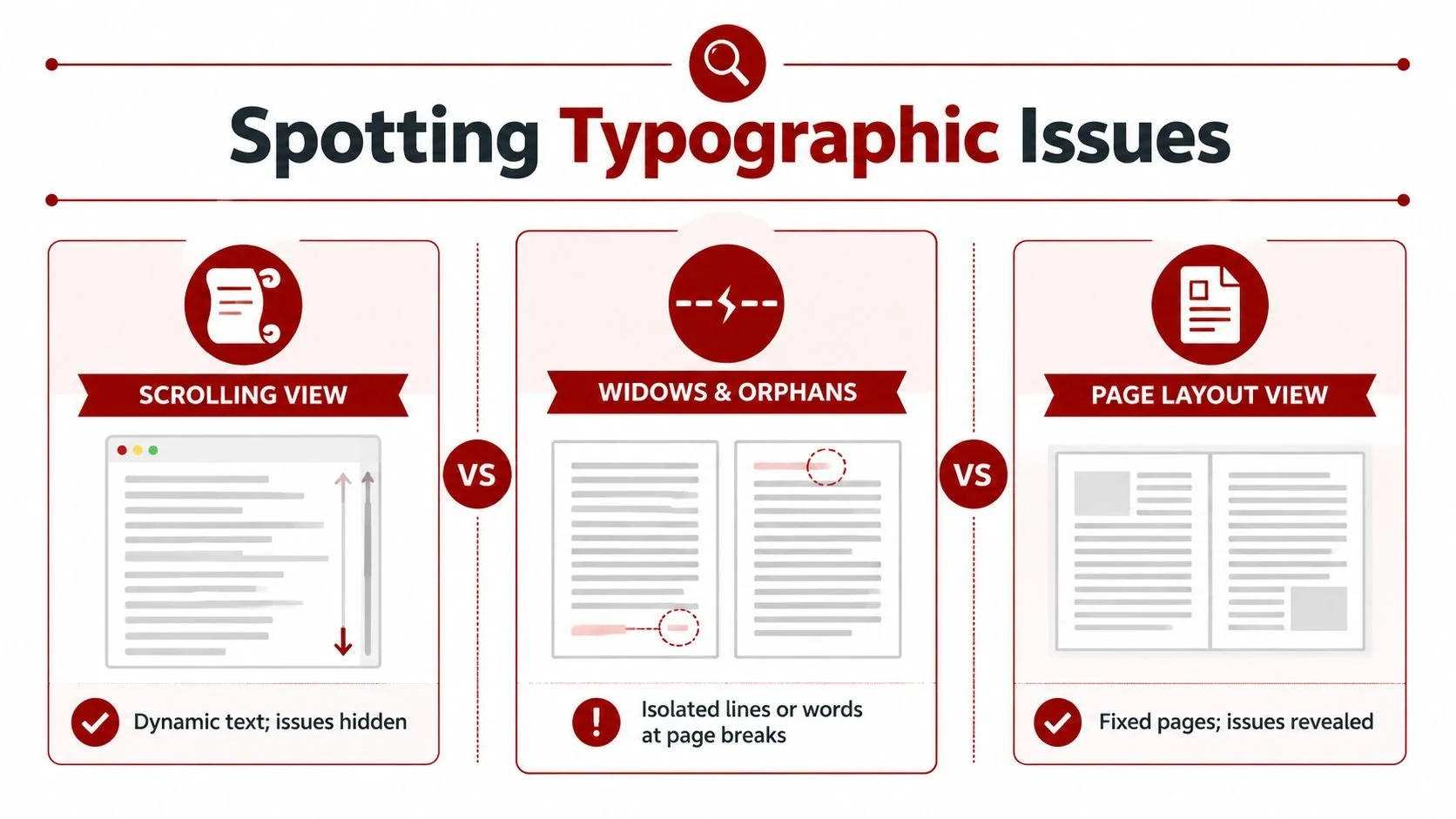
Draft view hides page behaviour: A scrolling manuscript doesn't show how paragraphs break across fixed pages.
Small changes create chain reactions: One font, margin, or spacing adjustment can affect pages far beyond the current chapter.
Readers feel the result quickly: They may not know the term, but they notice when the page looks awkward.
Practical rule: If a reader notices the formatting, the formatting is already working against the book.
There's also a broader industry reality. No public Canadian datasets track widow and orphan error rates in print books, which reinforces how specialised this part of the craft is, as noted by Superside. The work is judged less by public statistics and more by whether the page reads cleanly.
Authors who want a clearer sense of what that invisible craft includes can see it in this breakdown of the importance of good typesetting.
Defining Widows and Orphans in Simple Terms
A clean definition helps, because these terms confuse even experienced writers. In book design, an orphan is a line from a paragraph left alone at the bottom of a page. A widow is a short line pushed to the top of the next page, separated from the rest of its paragraph.
These aren't just technical annoyances. They change the shape of the page. Good typography creates an even text block that lets the reader move forward without friction. A stray line breaks that rhythm.
Why readers notice them even if they can't name them
Readers rarely stop and say, “That page has a widow.” What they feel is a stumble. Their eye lands on a line that looks abandoned. The page suddenly has too much white space in the wrong place. The spread loses balance.
In fiction, that can break immersion. In nonfiction, it can make the argument feel choppy or less organised. In memoir, where tone and flow matter, it can make a polished manuscript feel oddly uneven.
A few common examples make the issue clearer:
At the top of a page: the final short line of a paragraph sits by itself before the next paragraph starts.
At the bottom of a page: one lonely line drops below a paragraph while the rest of the paragraph sits on the next page.
At the end of a paragraph: a very short final line, often called a runt, creates a weak visual finish even if it doesn't cross a page break.
A reader doesn't need typographic vocabulary to feel when a page is off-balance.
A quick way to remember the difference
If you need a simple mental shortcut, think in terms of where the lonely line lands.
| Term | What it looks like | Why it feels wrong |
|---|---|---|
| Widow | A short line alone at the top of the next page | It starts a new page weakly |
| Orphan | A line alone at the bottom of the previous page | It leaves the page with an awkward drop |
| Runt | A very short final line in a paragraph | It creates a ragged, unfinished look |
For authors new to book production, this is part of the larger difference between drafting and design. A manuscript file holds words. Typesetting turns those words into pages. This guide to what typesetting is helps frame that difference well.
How to Spot Typographic Widows and Orphans
You won't get good at spotting widows and orphans in typography by staring at a manuscript in normal edit view. You need to look at pages as pages. That means a proof PDF, printed sample pages, or at least a layout view with the final trim size and margins applied.
Why Word hides the problem
Word and similar drafting tools encourage linear reading. You scroll. You revise. You search. That's useful for writing, but it hides the visual logic of a printed book.
A real book page has boundaries. The page ends whether the paragraph is ready or not. Once you fix the trim size, margins, line spacing, type size, and justification, text has to make hard choices. That's when isolated lines begin to appear.
The fastest way to train your eye is to stop reading for meaning and start scanning for shape.
Check page tops first: Do any pages begin with a weak leftover line from the previous page?
Check page bottoms next: Do any pages end with a single line that should have stayed with its paragraph?
Scan chapter openings: Short first paragraphs can leave too much dead space or create awkward page starts.
Look at the grey value of the page: The text block should feel steady, not patchy or broken.
What to look for in a proof PDF
A proof PDF tells the truth. It shows whether the page carries visual weight properly. A balanced page feels quiet. An unbalanced page attracts attention for the wrong reason.
One useful habit is to compare two pages side by side. On the weak version, you might see a single word sitting at the top of a page, followed by a large blank gap before the next paragraph settles in. On the corrected version, the page opens with a fuller text block and the reader's eye moves naturally.
Another habit is to flip quickly through pages rather than reading slowly. Fast page review makes interruptions stand out.
Checklist: Review your interior in spreads, not isolated pages. Problems often reveal themselves through contrast between facing pages.
If you're reviewing your own proof, zoom out first. A widow or orphan is often easier to see from a distance because it's a shape problem before it's a text problem.
Strategies for Fixing Widows and Orphans
Most fixes happen on two levels. First, software handles the obvious cases. Then a typesetter steps in and resolves the stubborn ones without damaging the rest of the layout. That second part is where the craft lives.
What software fixes well
Professional layout tools do a solid first pass. In Adobe InDesign, settings such as Keep Lines Together, Keep with Next, and paragraph composition controls can prevent many ugly breaks before you start polishing by hand.
That matters, because automation does save time. Recent AI-driven tools can detect 92% of issues automatically, but they still struggle with complex layouts such as bilingual text common in Canadian publishing, and they can create new problems like runts. Manual fixes still produce better final readability.
Software is best when the page problem is structural and predictable. If a heading should never sit alone, or a paragraph should keep a minimum number of lines together, the tool can enforce that rule consistently.
Here's what automatic controls tend to do well:
Apply minimum line rules: Good for avoiding single lines at page tops and bottoms.
Keep headings attached to body text: Prevents chapter titles or subheads from floating awkwardly.
Recompose paragraphs globally: A strong paragraph composer can improve line endings across a spread.
What still needs a human eye
Automation isn't subtle. It follows rules, but books don't always reward rigid rules. One fix can easily create a worse problem on the next page.
A common example is the orphaned final word at the end of a chapter page. The software may try to solve it by tightening spacing too much, pushing another paragraph badly, or creating loose lines elsewhere. In practice, a cleaner fix is often a small copy adjustment.
I've seen this happen repeatedly in final proofs. The best solution was not a dramatic layout change. It was removing two unnecessary words earlier in the paragraph so the last word pulled back naturally. The reader never notices the edit, and the page suddenly looks right.
Good typesetting often comes down to invisible decisions. The fix that leaves no fingerprint is usually the right one.
Manual fixes usually include a mix of these:
| Method | Best use | Risk if overdone |
|---|---|---|
| Tracking adjustment | Tightening or loosening a paragraph very slightly | Uneven colour if pushed too far |
| Hyphenation changes | Improving line breaks in justified text | Too many hyphens can distract |
| Non-breaking spaces | Keeping short phrases together | Can create new spacing issues |
| Minor copy edit | Pulling a line up or pushing a line down cleanly | Must preserve meaning and voice |
Automatic tools are fast and useful. Manual polish is slower, but it protects the page from the ripple effect. That's why the final pass still belongs to a human who can judge visual balance, not just line rules.
A Practical Guide for Different Writing Tools
Different tools handle widows and orphans in typography at very different levels. Some give you a basic safety net. Others let you shape page behaviour with real precision. If you're choosing between DIY formatting and professional production, the difference matters.
What Word and Google Docs can do
Microsoft Word includes widow and orphan control, and it can help prevent the worst page breaks in a draft. That's useful for long documents, especially if you want a cleaner manuscript before handoff.
Google Docs is more limited for this kind of page-level control. It works well for drafting and collaboration, but it isn't built for refined book interiors. You can force breaks and adjust some paragraph settings, but that's closer to patching than true typesetting.
For authors, the practical takeaway is simple:
Use Word for manuscript cleanup: good for reducing obvious problems before layout.
Use Google Docs for collaboration: good for editing text, not polishing pages.
Don't judge your final book by either tool's screen view: page composition changes once the book is properly built.
Why InDesign is the professional standard
Adobe InDesign gives typesetters the controls that drafting software lacks. It handles paragraph composition, page geometry, styles, and line behaviour in a way that makes real book production possible.
According to Adobe's guide to widows and orphans in typography, enabling Widow/Orphan Control to 2 lines resolves 87% of cases automatically. The remaining cases are often fixed with manual kerning or tracking adjustments of ±5 units and non-breaking spaces (~a).
Those details matter because they show the actual workflow. InDesign isn't magic. It's a strong first pass plus precise manual correction.
The owner's preferred setup is also practical and familiar to experienced formatters:
Keep lines together
Keep with next
Adobe Paragraph Composer instead of Single-line Composer
That combination usually gets most of the way there, but not all the way. For a broader look at software options, this roundup of formatting and typesetting tools for self-publishing authors is a useful comparison point.
Where LaTeX fits
LaTeX can do strong paragraph composition, especially for academic or technical books with references, formulas, and structured layouts. It's powerful when consistency matters more than visual experimentation.
Its weakness for many trade authors is practical, not typographic. It has a steeper learning curve, and many writers don't want to troubleshoot code-level formatting decisions while also preparing a publishable book.
A quick reference helps clarify the differences:
| Software | Feature/Method | Best For |
|---|---|---|
| Microsoft Word | Widow/orphan control in paragraph settings | Cleaner manuscript drafts |
| Google Docs | Manual page and paragraph adjustments | Collaboration, not final layout |
| Adobe InDesign | Keep Options, Paragraph Composer, tracking, non-breaking spaces | Professional print interiors |
| LaTeX | Automated composition through coded document structure | Academic and technical books |
Frequently Asked Questions About Typography
What's the difference between a widow and an orphan?
A widow is a short line left alone at the top of the next page. An orphan is a line left alone at the bottom of the previous page. In practical book work, both are signs that the paragraph broke badly.
Do widows and orphans matter if readers don't know the terms?
Yes. Readers don't need the vocabulary to feel the problem. They notice awkward white space, weak page openings, and uneven rhythm.
Can a good book still have one or two?
Sometimes a complex layout forces a compromise, especially in heavily illustrated books or books with strict page-length limits. Even then, the goal is to remove the distracting ones and choose the least harmful compromise.
Does fixing one problem create another one?
It can. This is the classic ripple effect. Tightening one paragraph may improve a page and damage the next spread. That's why experienced formatters review sequences of pages, not just one isolated fix.
Are widows and orphans the same as runts?
No. A runt is a very short final line at the end of a paragraph. It may sit within the same page and still look weak. It's related to page polish, but it isn't the same problem.
Do these issues matter in ebooks?
They matter differently. Reflowable ebooks don't use fixed pages the same way print books do, so widow and orphan control isn't identical. But paragraph composition, spacing, and clean structure still matter because poor formatting still interrupts reading.
What can an author do before sending a manuscript to a formatter?
Use a clean paragraph structure, avoid random manual spacing, apply consistent heading styles, and don't force line breaks to make pages look right in Word. Those shortcuts often create bigger problems later.
Best preparation: Send a clean manuscript, not a manually “designed” one. A typesetter can work faster and more accurately when the text hasn't been patched with local fixes.
If you want your manuscript to look like a real book instead of a converted document, Foglio Publishing can help with professional typesetting, formatting, and final production polish that catches the issues authors usually never see until it's too late.