
Ultimate Guide to Book Cover Dimensions for Authors and Designers
You’re probably staring at a cover file, a trim-size dropdown, or a printer template and wondering what the actual dimensions for book cover design should be.
The short answer is this: book cover dimensions are the full measurements needed to produce a print or eBook cover correctly, including trim size, bleed, spine width, and in some cases wrap or dust-jacket allowances. If you get those wrong, even strong cover art can fail preflight, shift in trimming, crack at the spine, or look awkward as a thumbnail.
For print, the starting point is usually the trim size of the book block. For eBooks, it’s the aspect ratio and pixel dimensions of the front cover image. You need the practical production details that first-time authors often miss: bleed, safe zones, barcode space, spine math, export settings, and platform-specific templates.
Book Cover Dimension Essentials
The phrase dimensions for book cover doesn’t just mean the size of the front. In professional production, it means the full specification for the entire cover file. For a paperback, that includes back cover + spine + front cover + bleed. For a hardcover, it can also include wrap allowances or dust-jacket flaps. For an eBook, it means the correct pixel size and aspect ratio for retailer displays.
That distinction matters because printers don’t build from your front cover artwork. They build from the final mechanical file. If the trim is off, the spine text won’t centre. If the bleed is missing, you risk white slivers at the edge. If the aspect ratio is wrong on digital platforms, the cover can display poorly or get flagged during upload.
Authors usually make one of two mistakes. They either choose dimensions too early, before the interior and page count are settled, or they choose them too late, after art has already been designed to the wrong proportions.
The practical workflow is straightforward:
Choose the final trim size first: That decision affects the interior layout, page count, and cover proportions.
Confirm printer specs next: KDP, IngramSpark, Blurb, and offset printers don’t all package files the same way.
Build the full spread, not just the front: Your design has to survive real trimming and binding.
Export for the destination: Print and eBook files are not interchangeable.
Practical rule: Cover design starts with production specs, not aesthetics. The artwork adapts to the file geometry, not the other way around.
When I’m reviewing a self-publishing project, I always check whether the chosen size fits the content, the market, and the printer. A memoir, a novel, a workbook, and an illustrated children’s title shouldn’t all inherit the same dimensions by default.
Standard Print Cover Dimensions
Most authors should begin with a trim-size decision, because that choice drives almost every other cover measurement. In the Canadian market, 6” × 9” remains the default trade size for a reason. It’s common, readable, easy to shelve, and friendly to both print-on-demand and offset workflows.
What dimensions actually include
For a print paperback, your cover file isn’t just “6 by 9”. That’s only the trim size of each panel.
The actual cover file width is:
front trim width + back trim width + spine width + bleed
The height is:
trim height + top bleed + bottom bleed
That’s why two books with the same front cover size can still need different final cover files. The page count and paper stock change the spine width.
According to Amazon KDP’s cover calculator, common paperback trim sizes for self-publishing include 5" × 8", 5.06" × 7.81", and 6" × 9", with 0.125" bleed on each side when bleed is required.
The trim sizes I default to most often
For a standard trade paperback, I usually start at 6" × 9". It suits most fiction and a lot of narrative nonfiction. It also aligns with Canadian market norms. In Canada, 6” × 9” accounts for 40% of self-published titles via POD, optimises spine width for retail shelving, and reduces production costs by up to 20% compared to larger formats.
I only move away from it when the content gives me a good reason.
5.5" × 8.5": Good for shorter literary work, memoir, and books that should feel a bit more compact in the hand.
5" × 8" or 5.06" × 7.81": Useful when portability matters more than display presence.
Square or wider formats: Better for children’s books and visual-heavy layouts.
Larger nonfiction formats: Useful when the page carries tables, diagrams, or dense instructional material.
I’ve also used custom sizes for books that felt visually wrong at standard trade proportions. One fiction project landed better at 5.25" × 8" because the manuscript was relatively short and looked stretched at 6" × 9". A smaller trim tightened the page architecture and gave it a more literary feel.
If you’re weighing trim size against readability and production cost, this practical guide on trim sizes, margins, and white space for self-published books is worth reviewing alongside your cover planning.
A good trim size should feel intentional when someone holds the book, not merely acceptable because a platform offered it.
eBook Cover Dimensions and Aspect Ratios
eBook covers are simpler than print covers in one sense. You only supply the front cover. They’re less forgiving in another sense because the file has to perform at thumbnail size across storefronts and devices.
The ratio that works across major retailers
For most self-published eBooks in Canada, the safest standard is a 1.6:1 height-to-width aspect ratio. The commonly recommended build is 2560 × 1600 pixels at 300 DPI. According to this eBook cover dimensions guide, that specification is recommended by Amazon KDP Canada, accounts for 72% of digital submissions, and helps reduce rejection rates by 95%.
That ratio works because it holds up across the major retail environments authors care about. A cover that looks balanced on Amazon also needs to hold together on Kobo and Apple Books. If your file is too squat, too narrow, or cropped oddly, your title treatment can become muddy fast.
The practical point isn’t just compliance. It’s legibility.
At thumbnail size, readers don’t see your texture overlays or subtle gradients first. They see shape, title weight, contrast, and hierarchy. Dimensions affect all of that because the canvas determines how much vertical room you have for typography and focal imagery.
Where authors go wrong with eBook covers
The most common issue I see is repurposing a print front cover without adjusting the composition for digital storefront behaviour. A print front can be technically usable as an eBook cover, but it isn’t always optimised for it.
These mistakes show up often:
Tiny subtitle stacks: They may look elegant full size, but disappear on retailer thumbnails.
Weak top-third contrast: Important because many storefront grids compress visual detail.
Overbuilt textures: Fine on a monitor, muddy in a small product tile.
Wrong aspect ratio: It can trigger awkward cropping or poor display.
If you’re troubleshooting upload issues, this post on top eBook validation errors and how they’re fixed is one of the better practical references for avoiding platform headaches before launch.
A clean eBook setup usually means keeping the front cover composition slightly bolder than the print version. Not louder. Just clearer.
If a reader can’t identify the title and genre quickly in a storefront grid, the cover isn’t doing its job, even if it looks excellent at full size.
Bleed Safety Margins and Spine Calculation
A cover can look perfectly aligned on screen and still come back from press with a clipped border, crowded barcode, or spine text that drifts off centre. I see that more often on Canadian self-publishing jobs than authors expect, especially when the file was built to trim size instead of full spread size.
The print setup that prevents expensive mistakes

For any printed cover with colour, photos, textures, or graphics touching the outer edge, build in 0.125 inch bleed on all sides. That is the standard working setup across North American POD and short-run print, and it lines up with what Canadian printers usually expect as well.
Bleed is the trim allowance. It exists so small cutting shifts do not leave a white sliver at the edge.
The safety margin is a separate zone inside the trim where live content should stay clear. Keep these elements comfortably inward:
Title and subtitle
Author name
Barcode area
Publisher logo or imprint
Critical image details, especially faces and fine lines
A practical rule I use for paperback covers is simple. Let the art run to the bleed, but keep text and other live elements at least 0.25 inch inside the trim, and give the spine-side edges a little more caution on thicker books. That extra restraint matters on books distributed in Canada through both POD and offset channels, where trim tolerance can vary slightly from one supplier to another.
How to calculate spine width properly
Spine width comes from page count and paper bulk. The formula is:
spine width = page count × paper thickness
The part authors miss is that paper thickness changes by printer and stock. A 320-page book on cream stock will not always have the same spine at every supplier. That is why reusing one platform's spread dimensions for another platform can cause trouble, even when the trim size matches.
For a trade paperback, the full cover width is:
back cover width + spine width + front cover width + left bleed + right bleed
The full cover height is:
trim height + top bleed + bottom bleed
Here is the practical math for a 6 inch × 9 inch paperback with a spine of 0.8 inch, which is a common ballpark for a mid-length novel on thicker stock:
Back cover: 6 inch
Front cover: 6 inch
Spine: 0.8 inch
Bleed: 0.125 inch left and 0.125 inch right
Full width = 13.05 inch
Height works the same way:
Trim height: 9 inch
Bleed: 0.125 inch top and 0.125 inch bottom
Final height = 9.25 inch
So the full wrap file becomes 13.05 inch × 9.25 inch.
According to IngramSpark's file creation guidance, spine size must be based on the final page count and paper type selected for the book. That sounds obvious, but it is one of the most common production errors I correct.
In Canada, I usually advise authors to confirm one more detail before export. Ask the printer or platform which stock they are using for that SKU, especially if the book may be printed regionally. The trim size may stay fixed, but the paper bulk can shift enough to affect spine centring on thicker books.
One more trade-off matters here. A technically correct spine is not always wide enough for readable spine text. On very low page counts, forcing type onto a narrow spine often looks amateur and can print poorly. In those cases, leaving the spine blank is usually the better production decision.
Hardcover Dust Jacket and Case Wrap Dimensions
Hardcovers add another layer of geometry. The front and back panels no longer end at the trimmed page edge. They extend to wrap over the boards, and that changes the file setup immediately.
How hardcover sizing differs from paperback
For a trade 6" × 9" hardcover, the cover face itself is typically larger than the interior trim. According to Reedsy’s book cover dimensions resource, a 6" × 9" hardcover jacket requires a cover size of 6.25" × 9.25", with 0.125" to 0.1875" bleed per side and 0.25" to 0.5" wrap for lamination.
That sounds small on paper. In production, it matters a lot.
A paperback file built to the trim edge can’t be repurposed as a hardcover. The proportions shift, and your type placement may need to move to avoid wrap zones, hinge areas, and board turn-ins.
There are two common hardcover approaches:
Dust jacket: Separate printed jacket wrapping over a case.
Image wrap or case wrap: Artwork printed directly onto the cover case.
What to watch on jackets and image wraps
Dust jackets demand more restraint than authors expect. The board edge, fold, and flap areas create visual interruptions. If your design has a single uninterrupted panoramic image, you have to plan where that image can safely break.
My usual checks are practical:
Keep live text away from folds: Especially on front board edges and flap turns.
Treat hinge areas cautiously: They’re not ideal for critical visual detail.
Plan barcode placement last: It needs a quiet zone and shouldn’t fight with flap copy or background clutter.
Avoid fussy edge treatments: Thin lines and near-edge ornaments often look misaligned once wrapped.
For image wraps, the biggest issue is usually underestimating how much art disappears around the turn-in. Authors approve a flat proof that looks centred, then receive a physical case where the composition feels pulled.
Hardcover files reward blunt, clear geometry. If you treat them like enlarged paperbacks, the cover usually looks amateur once wrapped.
Platform Specific Requirements
The platform matters because each printer interprets the same book slightly differently. Even when trim sizes overlap, the template logic, accepted files, and production tolerances can vary.
Cover Specs by Platform
| Platform | Print Trim Sizes | Bleed | File Types |
|---|---|---|---|
| Amazon KDP | Common options include 5" × 8", 5.06" × 7.81", and 6" × 9" | 0.125" on each side when bleed is used | PDF for print covers, image file for eBook front cover |
| IngramSpark | Supports paperback sizes within a broad trade range used by Lightning Source | Template-based bleed allowances depending on format | PDF preferred for print production |
| Blurb | Format depends on the product line and book style selected | Template-based | Print-ready PDF or platform template workflow |
| Offset printer | Fully custom within the printer’s manufacturing specs | Defined by the printer’s mechanical requirements | Usually PDF or PDF/X workflow |
This assumption often trips people up. They assume “6" × 9" with bleed” is one universal standard. It isn’t. It’s a category. The exact template still depends on printer calculations, page count, paper stock, and binding method.
Where platform templates trip people up
KDP is generally straightforward if you use its calculator and build exactly to the provided spread. IngramSpark is also manageable, but it expects a tighter production mindset because its distribution context is broader and its file handling feels more printer-driven than author-friendly.
Blurb often makes sense for visual books, but the workflow can differ enough that a cover built for KDP may need adjustment rather than direct reuse.
The practical differences usually show up in three places:
Spine width calculations
Bleed and wrap assumptions
Accepted export format and colour handling
A smart approach is to lock the destination printer before finalising the cover. If you try to make one “universal” print cover and force it into multiple systems later, you often end up revising the spine, moving the barcode, or rebuilding the whole spread.
I’ve seen authors lose time by designing from memory instead of from a generated template. Don’t do that. Generate the live template from the platform or the offset printer and design on top of it.
File Export Settings for Print Accuracy
A properly sized cover can still fail if the export settings are weak. Printers don’t judge your cover by how sharp it looked in Canva, Photoshop, or Affinity on screen. They judge the final file.
Export settings that usually hold up in production
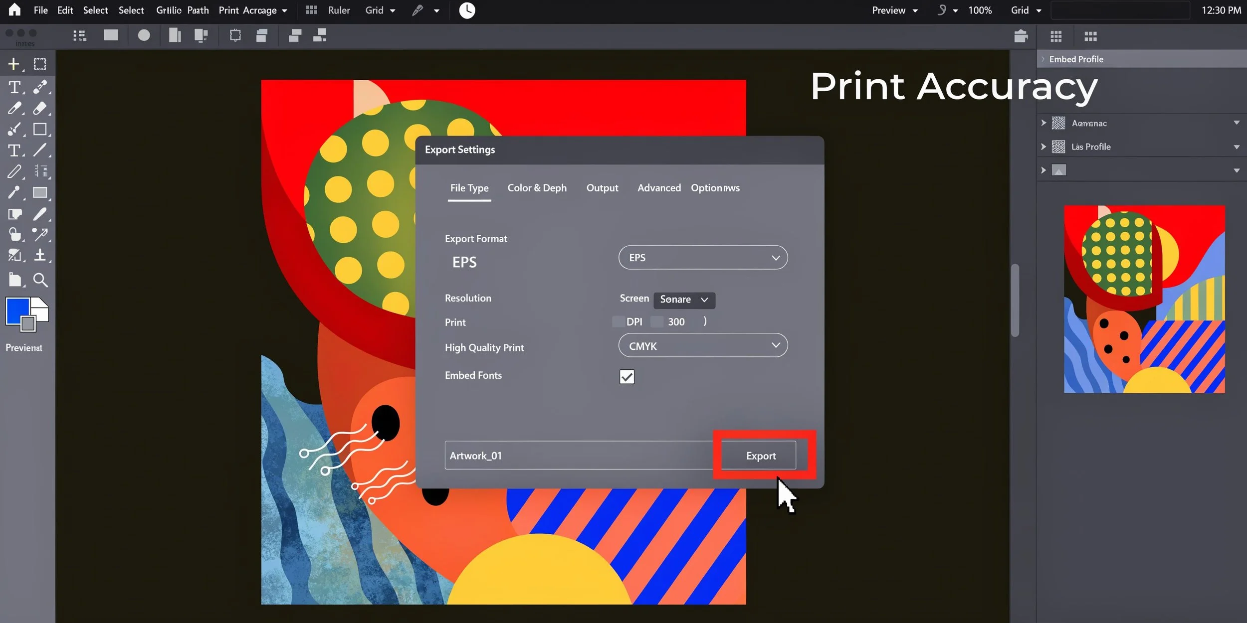
For print covers, I recommend exporting a press-ready PDF with these baseline habits:
Build at full size: Don’t design small and scale up at export.
Use 300 DPI artwork: Especially for raster images.
Convert with print in mind: CMYK is usually the safer workflow for print output.
Embed fonts or outline them when appropriate: Avoid substitution errors.
Include bleed in export: A bleed-aware document without bleed in export still fails.
For a standard trade paperback, I also check the full spread dimensions against the printer template before exporting. That simple habit catches a lot of mistakes.
If you need a deeper production checklist, this guide to print-ready book files is a practical reference.
Common export mistakes
Some errors are obvious once you know to look for them.
Supplying RGB artwork for a print workflow: It may still process, but the colour shift can be unpleasant.
Using low-resolution stock art: Softness often becomes visible in dark gradients and text overlays.
Forgetting bleed in the export pane: Common in InDesign and Affinity Publisher.
Placing text too close to the spine edge: It may look mathematically centred but print awkwardly on bound books.
I also tell authors not to trust a flattened JPEG as their master production file. It’s fine for previews. It’s not ideal as the only source file when a printer asks for a revision.
Working habit: Keep an editable master, a platform-specific production PDF, and a separate eBook front cover export. Don’t rely on one file to do every job.
Downloadable Templates and Quick Reference
Templates save time, but only if you treat them as production tools rather than creative constraints. A good cover template should do one job well. It should show you exactly where trim, bleed, spine, and safe areas live so your design decisions happen on the right geometry.
How to use a template without fighting it
I prefer layered templates because they let you isolate what matters.
A practical cover template should include:
Trim guides: The final intended size of the book
Bleed area: The zone beyond trim for backgrounds and full-bleed images
Spine guide: Based on the actual page count and stock
Safety zone: A visible reminder to keep live elements inward
The biggest mistake authors make with templates is deleting the guides too early. Keep them visible until the cover is locked. If you hide them at the start, you’ll almost always drift too close to an edge somewhere.
When working with a non-standard size, I use the same logic. I don’t improvise the setup. I rebuild the geometry and then adapt the design. That’s what happened on a custom fiction project where 5.25" × 8" felt better than the usual trade size. The narrower trim changed the text measure, the page feel, and the cover proportions, so the template had to change first.
A fast preflight checklist before upload
Before sending any file to a printer or platform, run a short manual check:
Does the trim size match the interior file?
Is the spine based on the final page count and stock?
Are all edge-running graphics extended into bleed?
Is every live element pulled inside the safety margin?
Does the barcode area have enough visual breathing room?
Are you exporting the right file type for the destination?
You don’t need a complicated preflight ritual. You need a repeatable one.
For first-time authors, templates remove guesswork. For experienced indie publishers, they reduce revision cycles. The best ones don’t just give dimensions. They make the production logic visible.
FAQ on Cover Dimensions
What are the standard dimensions for book cover files?
For print, there isn’t one universal file size because the full cover depends on trim size, spine width, and bleed. A 6" × 9" paperback cover file is larger than 6" × 9" because it includes front, back, spine, and bleed. For eBooks, the standard is usually based on a 1.6:1 aspect ratio front cover.
Do text-only book covers need bleed?
If no colour, image, or graphic runs to the edge, a cover may not technically need bleed. In practice, I still prefer setting up bleed from the start so the file is ready if the design changes later.
How do I calculate the full width of a paperback cover?
Use this formula: back cover width + front cover width + spine width + bleed on both outer sides. For a 6" × 9" paperback with a spine of about 0.8", the full width becomes 13.05" when you add 0.125" bleed on each outer side.
Can I use the same cover file for print and eBook?
Not as a production file. The eBook uses only the front cover and needs digital pixel dimensions. The print edition needs a full spread with bleed and spine. You can use the same design concept, but the final files should be exported separately.
Why does my spine text look off-centre in print?
That usually happens because the spine width was calculated too early, the wrong paper thickness was used, or the file was exported to the wrong template. Spine alignment issues are production issues first, design issues second.
What happens if I choose a non-standard trim size?
A custom size can work well if it suits the manuscript, but it usually needs more careful checking for printer compatibility, margin balance, and cover proportions. Standard sizes are easier to produce. Custom sizes can feel better when they’re chosen for a clear reason.