
Colour Psychology & Genre-Driven Trends: How to Design a High-Converting Book Cover in 2025

A book cover has two jobs that must happen in the same heartbeat. It needs to stop the scroll or the passerby, and it needs to whisper the truth about your genre so readers know they have found their kind of story. Competitors often say things like keep it simple, use contrast, and aim for symmetry. All true. What they rarely explain is why certain colours and visual choices pull the right readers closer. This guide goes deeper. We will look at colour psychology, show how different genres lean on different palettes, and tie those choices to clear actions you can take with your designer.
If you want an expert to carry this across the finish line, see our Cover Design services. We pair colour, imagery, and typography with your audience and your author brand. For a complete book that feels cohesive from jacket to last page, see Formatting & Typesetting.

What is colour psychology? A plain language summary
The fascinating field of colour psychology studies how colours modify mood and behaviour. Brands use it every day. Grocery packaging leans on warm reds and yellows to spark hunger and urgency. Luxury brands use blacks, deep blues, and muted metallics to signal calm, confidence, and price. The same pattern shows up in book covers. A cover is a tiny billboard. You have a second or two to create an emotional cue that matches the promise of your genre.
Common associations, backed by decades of marketing practice and consumer research:
Red suggests passion, danger, urgency, and heat.
Pink points to romance, tenderness, and fun.
Orange signals energy and approachability.
Yellow suggests optimism and curiosity.
Green connects with growth, nature, and renewal.
Blue carries trust, intelligence, and calm.
Purple leans into mystery, wonder, and the fantastic.
Black gives power and edge.
White gives clarity and space.
Gold and metallic accents suggest prestige.
No single colour means one thing in every context. Shade, saturation, and pairing matter. A bright cyan headline on charcoal reads bold and modern. The same cyan washed out over pale grey can feel tired. This is why genre context is so important.
Genre-specific colour trends that convert in 2025
Readers arrive with mental models. They do not always name them, but they feel them. When your cover lines up with those models, they click faster and they trust more.
Romance
Warm palettes dominate: reds, pinks, peaches, and soft creams. Contemporary romantic comedies often use bright, flat colours and clean vector illustrations. Historical romance tends to add cream, gold, and muted florals. Dark romance moves toward black, burgundy, and metallics. These choices tell us about heat, intimacy, and tone before a single word.

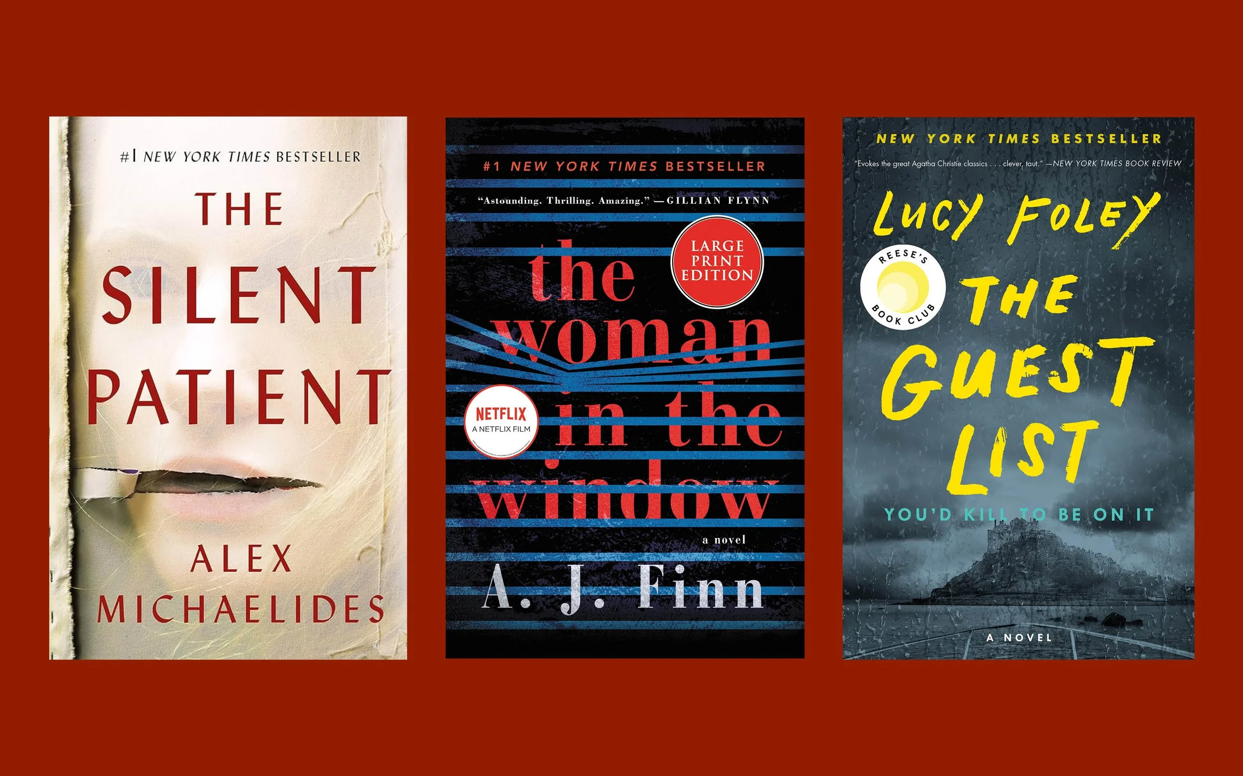
Thriller and crime
Thrillers love contrast. Black backgrounds. Stark white or acid yellow type. Splashes of red for a note of danger. Blues and steel greys add a forensic or cold case feel. Sharp sans serif titles, uppercase, and high contrast images read tense and fast. Your reader should sense motion and risk.
Science fiction
Neon accents on deep space grounds are still strong: electric blues, teals, magentas, and violets against navy or black. Geometric shapes and clean grids signal near-future tech. Dusty oranges and retro blues nod to space opera. The palette should feel otherworldly but controlled.

Fantasy
High fantasy leans into jewel tones: emerald, sapphire, amethyst, and rich gold detailing. Think ornate type and illuminated motifs. Urban fantasy often shifts to dark neutrals with a single bright accent. Mythic or folkloric tales use natural greens, stone greys, and parchment textures. Purple remains powerful for magic and the uncanny.

Memoir and literary
Here restraint sells. Muted palettes, photographic imagery, and thoughtful serif type suggest depth and credibility. Cool blues and greys carry quiet authority. Earth tones can signal place and memory. Avoid gimmicks. Let colour support the voice rather than shout over it.

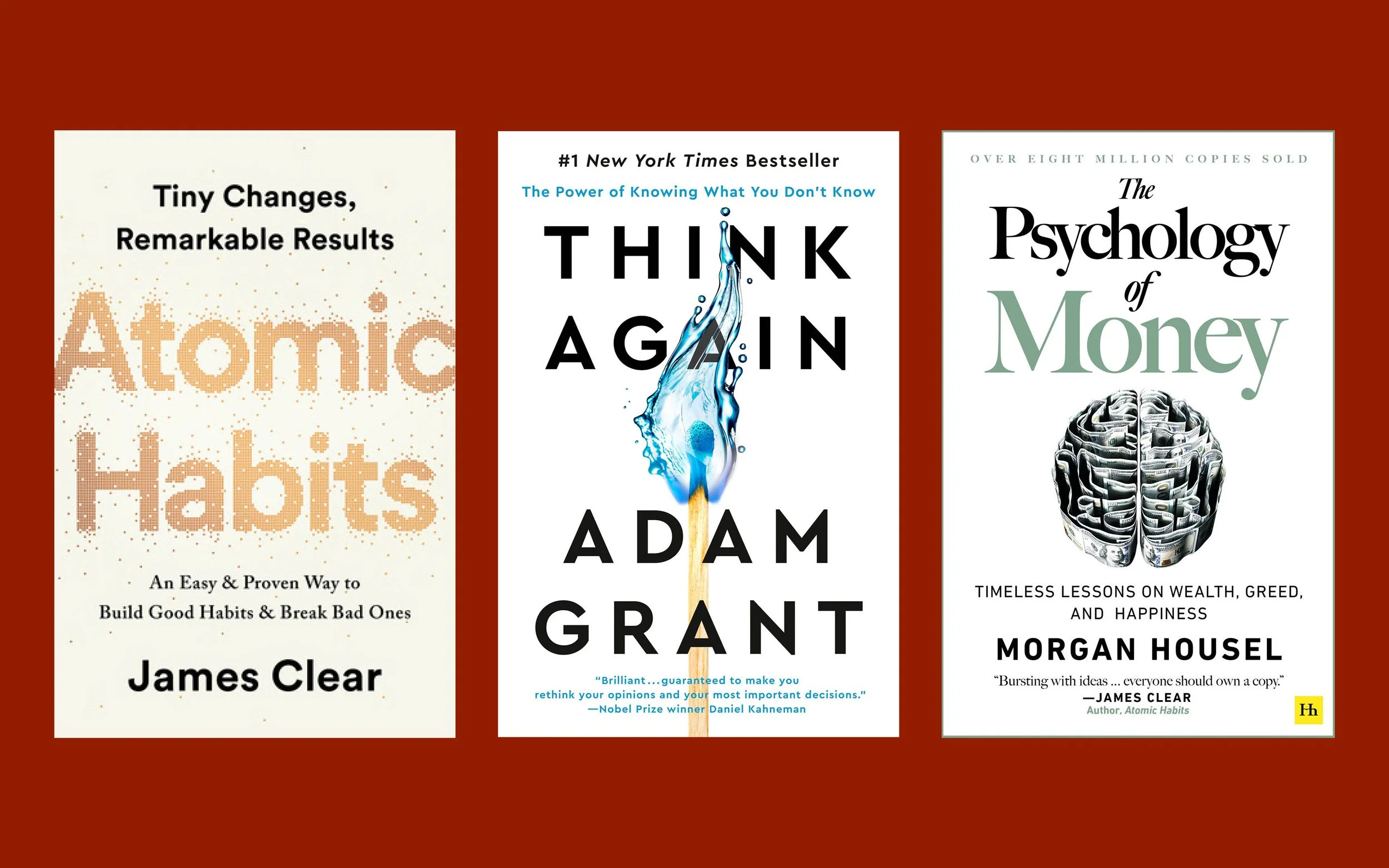
Self-help and business
Clarity wins. Blues for trust, greens for growth, yellows for optimism, and punchy red or orange for activation. High contrast between title and background is essential at thumbnail size. Clean, confident typography does much of the work here.
These are patterns, not cages. You can break a rule on purpose. Just be sure you understand the expectation you are bending so your cover still reads as your genre.
Colour harmony and composition that work at real sizes
Good colour is not only about the colours you pick. It is also about how those colours live together.
Complementary schemes set colours opposite each other on the wheel. Blue with orange, red with green, purple with yellow. These pairings create energy and pop.
Analogous schemes place neighbours together. Blue, teal, and green. Red, orange, and coral. These are calm and cohesive.
On a cover, you often want one hero hue and one supporting hue. The rest can live in neutrals. This gives you contrast and a clear focus. Balance bright areas with quiet areas so the eye knows where to go.
Thumbnail tests matter. Many readers will see your cover at 120 pixels tall on a phone. Make sure the title remains legible and the colour contrast holds up. If the title muddies out when the image is small, adjust the palette, weight, or placement.

Some recent Foglio cover designs. You can safely make assumptions about the genres just by looking at these thumbnails.
Image selection and typography that respect colour
Image and type should not fight your palette. They should carry the same story.
Photography vs illustration. Contemporary romance and rom-coms often use flat illustration with bold colour fields. Thrillers lean on stark photography, often with blur or motion. Fantasy thrives with symbolic illustration.
Typography as tone. Serif faces convey tradition, history, and literary weight. Sans serifs feel modern and fast. Script can support romance in small doses. Decorative display type belongs to specific subgenres and works best when paired with a sturdy secondary face.
Guide the eye in a clean order: title, subtitle, author name. Use weight and contrast, not tricks. Avoid stacking too many colours in the type itself. Let the palette carry the emotion while the words stay readable.
If you want a partner to align type choices with your brand and genre, our Cover Design service handles art direction, font licensing, and layout. For a complete, consistent reading experience, we match your interior to the cover through Formatting & Typesetting.
Practical steps for self-publishers
Start where your readers already are. Visit the top lists in your category on Amazon, Kobo, and Indigo. Save 20 covers that make you stop. Now look at them as a set. What colours repeat. What kind of imagery. How bold is the type. You are not copying. You are finding the visual language of your shelf.
Build a simple brief for your designer. Just one page is enough.
Book pitch in two lines.
Target reader.
Three to five comp titles with notes about colour and type.
Mood words.
Any author brand colours you want to keep.
Ask your designer for a first round with clear colour directions. See one safe choice that aligns with your comps, one with a restrained twist, and one wild card. Review at full size and thumb size. If the book will go to print, ask to preview a mockup on both cream and white backgrounds since paper tone will shift your colours slightly.
DIY can work for early tests or very small budgets. Canva and Adobe Express have templates that teach basic alignment, contrast, and type scale. They are helpful for mockups you will show to beta readers. For a real release, a professional pays off in both polish and speed, especially when you need final print-ready files for KDP and IngramSpark.
Common pitfalls and how to avoid them
The most common error is mixed signals. A dark, moody palette with playful script type confuses readers. A bright candy cover on a serious memoir tells the wrong story. Decide the promise you are making, then let colour and type serve that promise.
Another trap is too many colours. Two strong colours and a neutral base are usually enough. More can work in children’s and some fantasy, but it requires careful control of value so the title does not get lost.
Beware of readability at thumbnail. Fine lines, low contrast, and complex textures can look beautiful full screen and then collapse to noise on a phone. If you must place type over a busy image, use solid blocks or soft vignettes to create a clear field behind the words.
Finally, do not chase trends for their own sake. Neon gradients may be hot this month. They will date quickly unless they fit your subgenre and tone. Ground your choices in reader psychology and genre expectations first. Add a fresh touch second.

A short colour psychology cheat sheet by genre
Think of this as a starting map, not a rulebook.
Romance: reds, pinks, peaches, creams, soft purples. Warm and inviting.
Thriller and crime: black, white, deep blues, acid yellow or red accents. High contrast and tension. Distressed text effects do nicely as well.
Science fiction: violets, teals, neon blues on navy or black. Clean grids and luminous accents.
Fantasy: jewel tones with gold or copper. Textures and ornate type. Skeuomorphic design works well for fantasy (though it is a bit passé in practically every genre)
Memoir and literary: restrained palettes, soft blues, neutrals, and earth tones.
Self-help and business: blues for trust, greens for growth, bright yellow or orange for action, with strong, simple type.
Test your concept with early readers. Show two or three options, not ten. Ask what genre they think it is, what mood they feel, and which version they would click first. Their gut reactions will tell you if the colours are doing the quiet work you need.
Bringing it together with production realities
Colour choices don’t live in a vacuum. Paper stock and print method will nudge your palette. On KDP, cream paper softens colours and warms neutrals. On IngramSpark, white stock keeps cool tones cooler. Covers printed with matte laminate will mute saturation a touch, while gloss tends to punch colours and deepen blacks. If you plan store outreach, ask for a printed proof. Hold it under daylight and indoor light. Make small adjustments before you lock files.
If you are curious about paper and trim decisions, read our guide, Choosing the Right Trim Size and Paper, and our Self-Publishing Timelines post for when to book design and proofs in your schedule:
Why the colour conversation belongs with your author brand
Once you find colours that both serve and accurately convey your genre and your unique style as an author, you might consider carrying them into subsequent releases with a twist (while keeping them familiar). Readers love recognition, and a steady palette across a series or even across an author’s oeuvre in general improves click-through and trust. We can help you set a simple brand guide with colours, type, and layout notes that speed every future project.
See how we connect cover and interior so the reading experience feels intentional from the first glance to the last page:
Conclusion
Colour is more than just decoration—it’s direction. It suggests to a reader what to feel and what kind of story they are about to enter. When your palette matches your genre and your message, your cover stops the right people and turns a glance into a click. Start with the psychology, confirm with your shelf research, and test at the sizes that matter. Keep it clear. Keep it legible. Let colour and type do their quiet work.
If you want a cover that sells the promise of your book without guesswork, book a free consultation and we will build a concept that fits your story, your audience, and your goals.
