
Coated vs Uncoated Paper: The Self-Publisher's Guide to Choosing the Right Stock in 2026
Coated vs Uncoated Paper: What Every Author Needs to Know Before Going to Print
Paper might be the last thing on your mind when you're finishing a manuscript, but it's one of the first things a reader's hands and eyes register when they pick up your book. The difference between coated and uncoated paper comes down to surface treatment: coated paper has a clay-based layer applied to its surface that reduces ink absorption, producing sharper images and more vibrant colour reproduction. Uncoated paper has no such treatment, so ink absorbs into the fibres and produces a softer, warmer appearance that's far easier on the eyes during long reading sessions. That's why virtually every traditionally published novel uses uncoated interior stock, and virtually every photography book or coffee table book uses coated.
Choosing the wrong stock doesn't just affect how your book looks on a screen preview. It affects how readers physically experience the book, and they'll notice, even if they can't name exactly what feels off. A self-published novel printed on glossy coated stock reads like a brochure. A coffee table book printed on uncoated offset stock loses all photographic depth. These are the kinds of production decisions covered in detail in our guide to paper choices and colour strategies for self-publishers.
For Canadian authors publishing through IngramSpark or Amazon KDP, the options are more limited than offset printing allows, which makes it even more important to understand what each platform actually offers before you finalise your specifications. Resources from Domtar, Ironmark, and Blurb's paper support documentation all confirm this distinction, but none of them address the specific decisions indie authors face when choosing between POD platforms, offset runs, and hybrid options.

Paper Stock Explained: How Coated and Uncoated Options Shape Your Book's Look, Feel, and Readability
Pick up a magazine and a novel and run your thumb across the interior pages of each. The magazine's pages feel smooth, slightly cool, and almost slippery. The novel's pages feel slightly textured, warmer, and more natural. That physical contrast is the difference between coated and uncoated paper, and it goes far deeper than texture.
The surface chemistry
Coated paper is manufactured with a clay-mineral layer applied to one or both sides of the base sheet. According to Ironmark, this coating seals the surface so that ink sits on top rather than being absorbed, which is what gives coated pages their characteristic sharpness and colour density. Uncoated paper has no such layer, so ink spreads slightly into the fibres on contact, producing a gentler, more diffused result that's warm and readable but less colour-accurate for photographic reproduction. Domtar's overview of paper types explains this absorption difference clearly and notes that it also affects how quickly ink dries on each surface.
The three coated finishes relevant to book publishing
Coated paper isn't a single product. It comes in three finishes that matter to authors and designers:
Gloss coated has the highest sheen and the most colour pop. It's ideal for photography books and heavily illustrated titles where image vibrancy is the priority, but the reflective surface can create glare under reading lights.
Silk or satin coated sits in the middle, offering reduced glare while still holding colour detail well. It's a popular choice for art books and illustrated non-fiction.
Matte coated has a flat, non-reflective surface but still retains the colour density of coated stock. It's a useful option for books that need strong colour without the sheen.
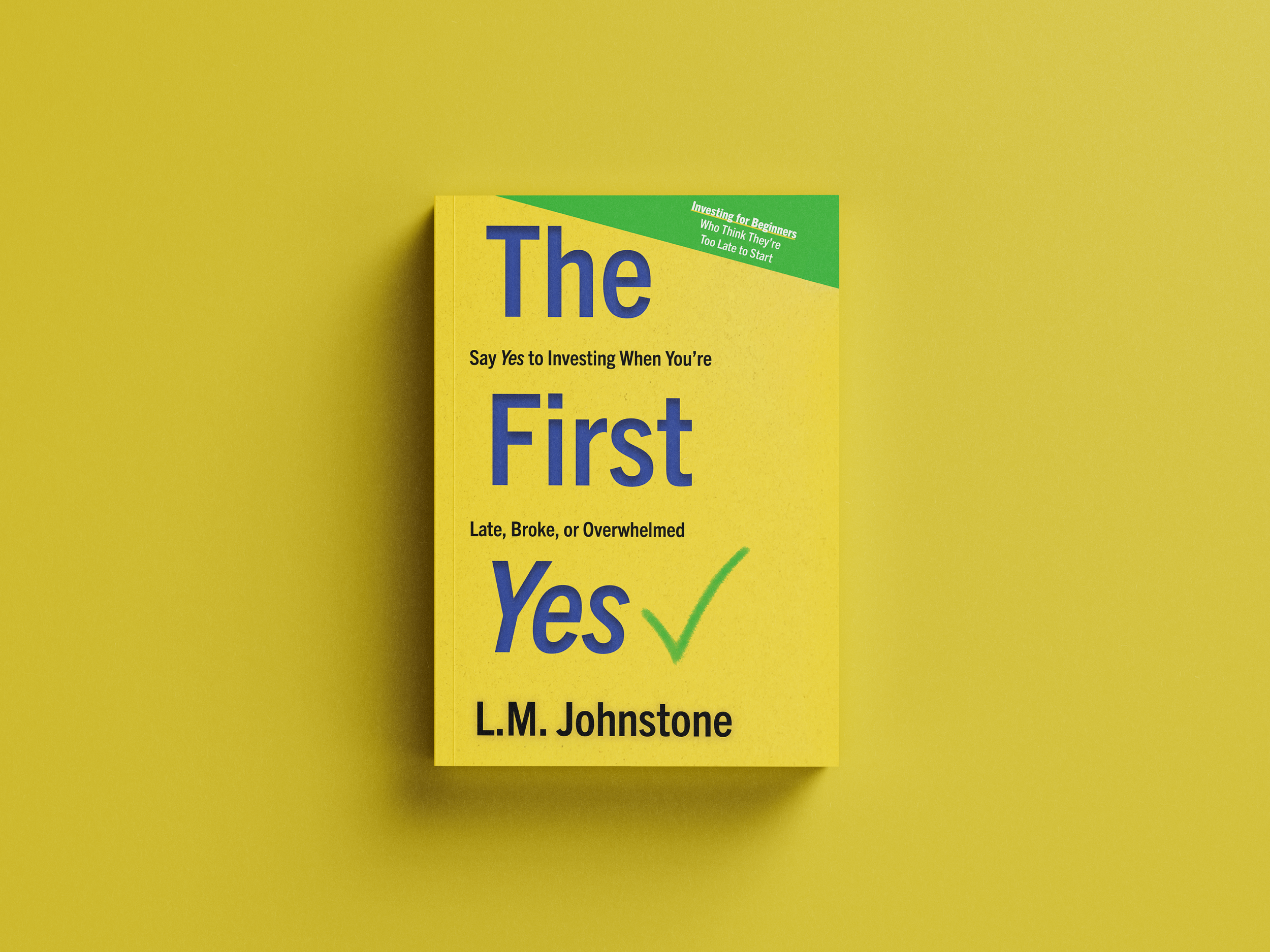
Cover finishes work differently from interior stock. Soft-touch matte laminate, applied to a book's cover rather than its interior pages, creates a velvety tactile finish that's become a premium standard among indie authors. It's increasingly offered by Canadian print services as a cover lamination upgrade, and it communicates quality instantly when a reader picks the book up. If you're thinking through cover options, our roundup of cover design tools for self-publishers covers the design side of this decision.
Matching paper to genre
For novel interiors, uncoated cream or white offset stock in the 50–60 lb range is the industry standard. The cream variant is especially important for fiction and narrative work because it reduces eye strain across hundreds of pages and gives the book the familiar, trusted hand-feel readers associate with quality fiction from a bookshop shelf. Authors writing memoirs and narrative non-fiction frequently default to bright white uncoated stock because it looks clean on screen, but this choice produces harsh contrast that tires readers' eyes. The cream-toned uncoated stock used in trade publishing exists precisely to solve this, and it costs the same.
Coffee table books and art books need coated stock, typically 80–100 lb gloss or silk, because the coating locks photographic detail on the surface. Without it, shadow gradients flatten, fine colour gradations blur, and skin tones in portrait photography can shift noticeably. Blurb's documentation on paper differences makes this point well in the context of photo book production.
Children's picture books are a unique case. Interior pages are almost always printed on coated stock for illustration vibrancy, but the paper weight is higher (often 100 lb and above) and pages are frequently laminated to survive small hands. The evolution of self-publishing has made these formats increasingly accessible to indie authors, but getting the production spec right still requires careful planning.
Platform limitations for Canadian authors
On IngramSpark, Canadian authors can select white or cream uncoated interior paper for standard black-and-white books. The 70 lb white and 60 lb cream options are the most commonly chosen, and coated paper is available for full-colour books at a higher per-page cost. Amazon KDP offers white or cream uncoated for black-and-white interiors and a premium colour option that uses a coated-like stock. What neither platform provides is the range of paper weights, specialty finishes, or custom stock combinations that offset printing allows.
Offset printing through a Canadian printer gives authors access to 80 lb gloss coated, 100 lb silk, various uncoated options, and custom combinations, such as a coated insert section within a primarily uncoated book. This kind of flexibility is worth understanding before you commit to a POD-only distribution model. Our guide to perfect binding for authors addresses how binding method and paper stock interact, which is a consideration that affects both cost and shelf appeal.
Discussions among self-publishers on platforms like Reddit's bullet journal community highlight how much paper choice matters to hands-on book users, particularly in terms of writing and ink performance. And for a practical visual walkthrough of paper differences in a print context, this YouTube comparison is a useful reference.
Technical pitfalls that cost authors money
One of the most expensive mistakes in book production is sending RGB-mode files to a coated-paper print job and expecting accurate colour output. Coated stock prints in CMYK, and uncorrected RGB files can shift hues dramatically, particularly in blues and skin tones. Our breakdown of CMYK vs RGB for print explains how to prepare your files correctly before submitting to any printer.
Typesetting choices also interact with paper type in ways that aren't obvious until you're holding a printed proof. Tighter leading and smaller type sizes that read comfortably on bright white coated stock can become difficult on cream uncoated stock, because the slightly lower contrast between ink and page requires a marginally larger type size for comfortable reading. How typesetting affects readability goes into detail on exactly these kinds of decisions.
Some Canadian book printers publish general guidance on paper types, but that guidance doesn't address the specific workflow decisions indie authors face when aligning IngramSpark file specifications with offset print proofing, or choosing between POD and short-run offset for a first edition. Authors working without a production team often make isolated decisions from a platform's dropdown menu without understanding how those choices interact with their genre, distribution plan, or budget. Our list of best self-publishing companies in Canada in 2026 outlines what to look for in a partner that covers these decisions as part of the service.
Choosing the Right Paper Stock Is a Publishing Decision, Not Just a Print Decision
The decision between coated and uncoated paper isn't a minor technical detail you sort out at the end of the production process. It's inseparable from your genre, your distribution platform, your reader's experience, and your budget. Treating it as an afterthought is one of the most correctable mistakes in self-publishing, and it's one that professional support prevents entirely.
Authors who work with a full-service Canadian self-publishing partner receive paper specification guidance as part of a broader production plan. That means the paper decision is made in context, alongside your binding method, your typesetting, your colour strategy, and your print run size, rather than in isolation through a dropdown menu on a print platform.
Getting paper right from the start saves money by avoiding reprints, builds reader trust through a professional hand-feel, and signals to booksellers and reviewers that your book was produced with the same care as any traditionally published title. If you're planning your book format from the start and want guidance that covers every production decision in sequence, Foglio Publishing's done-with-you self-publishing service is built precisely for this kind of end-to-end support.
Frequently Asked Questions: Coated vs Uncoated Paper for Authors
Q: How do you know if a paper is coated or uncoated?
The quickest test is to run your fingertip across the surface. Coated paper feels smooth, slick, or slightly glossy and reflects light uniformly. It also resists a drop of water, which beads on the surface rather than absorbing, as noted by both Domtar and Ironmark. Uncoated paper feels slightly toothy or textured, has a warmer, less reflective appearance, and absorbs moisture almost immediately. In a book context, flip to the interior pages: if they feel like a magazine, they're coated; if they feel like the pages of a novel from a bookshop, they're uncoated.
Q: Is uncoated paper good for writing on?
Yes, uncoated paper is significantly better for writing on than coated paper. Its open, porous fibre surface grips ink from ballpoint pens, gel pens, and markers rather than causing it to bead or smear. This is confirmed by community testing documented on Reddit's bullet journal thread, and it's why every notebook, journal, planner, and workbook uses uncoated stock. For authors producing interactive books, such as workbooks, guided journals, or children's activity books with fill-in sections, uncoated interior stock is essential. Coated paper causes ink to smear and dry slowly, making it a poor surface for any book designed to be written in.

